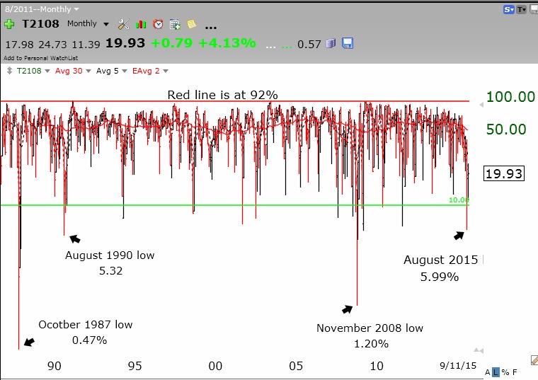
I am coming around to the idea that the market decline may have already put in a bottom. Here are my reasons. First, the Investors Intelligence poll has now reported that there are more bears than bulls, a very rare occurrence. Market sentiment polls are called contrary indicators because when the results reach an extreme, the market often reverses and goes the other way. Too much bearish sentiment is often a precursor to a decline’s end. Second, during the August decline, another contrary indicator, the put/call ratio, reached an extraordinary high of 1.42. That means that people were trading a lot more put options than call options (142 puts for every 100 calls). Put options are bets that an equity will decline, while call options are bets that it will rise. This extreme bearishness in option traders is another sign of at least a short term bottom. Third, I have often written that when the Worden T2108 indicator goes into single digits, I should back up the truck and buy a large market index ETF like SPY. This is psychologically very difficult to do in the middle of an extreme market decline, but this low level of the T2108 indicates a severely oversold market. This monthly chart shows the complete history of the T2108 indicator since its inception in 1986. There have been only 3 times since 1986 when the market has had a lower reading of T2108 than the 5.99% reading reached last month. The one month in October, 1987, when the market declined 20% in one day was the lowest recording of T2108 ever recorded, 0.47% and in 2008 it reached 1.2%. Last month’s reading of 5.99% was the 4th lowest monthly reading ever recorded. T2108 measures the percentage of all NYSE stocks that are below their 40 day simple moving average. I interpret it to act as a pendulum of the market and post it each time to the right of this blog page. (It is also incorporated in the Worden software.) I look for market bottoms when T2108 is in single digits. The green line in the chart is drawn at 10%. (Click on chart to enlarge.)
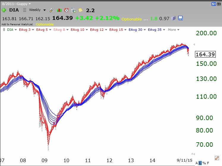
 On the other hand, this weekly GMMA chart of the DIA shows it to be at the beginning of a bearish BWR pattern, with all of the shorter term averages (red lines) now trending below the longer term averages (blue) with a white space separating them. I tend to exit the market when this bearish pattern occurs in the major averages. Looking at this chart it is impossible to tell if this decline will end in a few months like it did in 2011 or take over a year like it did in 2008. One never knows in advance when a market decline, once started, will end….
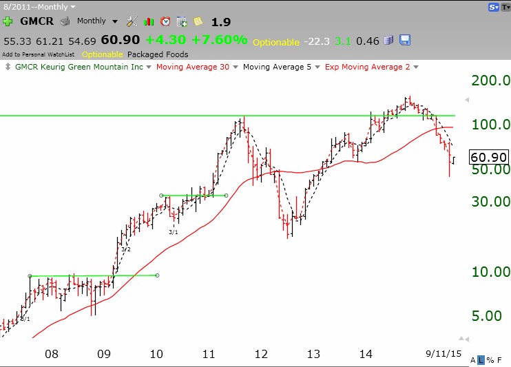
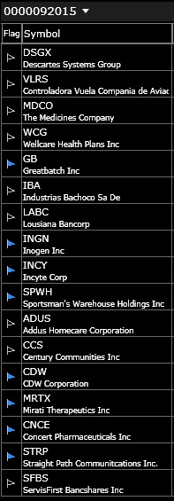
I love weak markets when few stocks hit new yearly highs. It is easier to see the leaders. A stock that can come through a large decline at new highs is evidencing unusual buying interest. I like to keep such stocks in a separate TC2000 watch list for me to monitor. (I often set an alert in TC2000 to tell me if the stock breaks out.) This is how I found GMCR when it broke above a a green line top to an all-time high in early 2009 after the 2008 bear market ended. GMCR eventually became a 10 bagger (10x increase).
On Friday, there were only 37 new highs and, after looking at their long term charts, I selected these 17 stocks to keep in my watch list. Most are above a recent green line top. I, of course, will not buy anything until I see a new market up-trend and have the wind at my back. One of the stocks on this list, INGN, I wrote about last December because my talented stock buddy, Judy, liked it. Then the stock was at $30.25, last Friday it closed at $54.58, up 80% from when I wrote about it. (Any of you buy and hold it?) I have asked Judy to research this list for more gems……
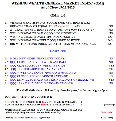
 The GMI remains at 0 (of 6).