In the past, I exited mutual funds in my university pension accounts only after the longer term trend had turned down. That has not happened yet. In my more tradable IRA accounts I exit the market more frequently when some weakness becomes apparent to me. I do not want to give back all of my recent gains. So when the major indexes appeared to me to be weakening, I sold my TQQQ and other stocks and went to the sidelines.
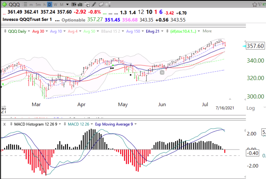
One indicator suggesting weakness is the 12/26/9 daily MACD histogram that turned red Friday, after days of declining. The chart below shows this relationship. The MACD histogram reflects the difference between the MACD line (blue) and the signal line (purple). When the MACD line crosses below the signal line the histogram turns negative, or red. Note what happened to QQQ when the histogram turned red in March and May. The MACD is a measure of momentum and as the histogram lines decline it indicates waning strength of the move. Similarly, when the lines are rising it indicates strength. During most of the recent QQQ short term up-trend since 5/24, the histogram has been black, indicating that the MACD was above the signal line. But notice how it has been declining and turned red on Friday. The histogram does not have to remain red for long, but it signals to me at least current short term weakness. By the way, the histogram for SPY also turned red on Friday. Check it out for yourself!