What a market top looks like

I teach my students to let the action of the market reveal its true nature.   Ignore the interpretations of the media pundits, who are typically most interested in selling their advice. Many of these pundits have been warning of an imminent market top.   They have their many logical scenarios and use fundamentals and statisitcs   to back up their   prophesies.

I prefer to use my technical tools to characterize market tops and to compare them to the current market. Below are some GMMA monthly charts of the SPY (S&P500 index ETF) at the 2000 and 2008 market tops.   These monthly charts display 12 exponential moving averages plus the monthly close of the index (dotted line).   The red lines are shorter term averages and the blue lines are longer term averages.   As long as the red lines are rising above the blue lines so that there is a white space between them, we have the powerful RWB (red white and blue) pattern and the market is advancing.   When the red lines converge with and fall below the blue lines leaving a white space between them we have the BWR pattern and the potential for a significant decline.

Market tops take months to develop, leaving plenty of time for the watchful investor to exit the market. Note the pattern of the SPY as it formed a top in 2000-1:

GMMASPYmonthly

And again in 2007-8:

GMMASPYmonthly2008

Compare these patterns to the current pattern of the SPY:

SPYGMMAmonthly2014

I see nothing resembling a topping pattern.   Do you????? (The red arrows show the month of May from a prior Sell in May analysis.) To the contrary, the market looks like full speed ahead……

And the GMI, with all components positive, is still on the Buy signal flashed on April 22nd.   Since April 22nd, SPY is up +3.9%, the QQQ is up +6.0%, and the DIA is up +2.6%. In addition,     the 3x leveraged ETF, TQQQ is up +18.3%,   AAPL is up 21.4% and GMCR is up +23.7%.   I see again proof   that if I do not want to spend time searching for the rare individual stock that will greatly out perform the indexes, the best bet is for me to wade into the TQQQ during an up-trend. That is what I have been doing…..

GMI06062014

Ignore the media pundits–Stage Analysis shows markets remain in up-trend

GMI5/6
GMI-28/9
T210862%

Every time I open my browser it opens the marketwatch.com webpage.   This site is a wonderful way to keep up on the trend of the market during market hours.   It also has many great articles.   However, I am struck by the number of pundits who have recently written about the tough market that we have and how weak and dangerous it is. While I often read such articles, it is important for me to remind myself that no one knows what the market will do in the future.   The best I can do is to use technical analysis to determine the current and recent trend of the market.   Trends tend to continue along—until they don’t! The only way I know to interact with the market is to stay on the side of the current trend and to manage my position size and exit points as the trend strengthens or weakens.

Now, how can one measure the trend?   It depends first on one’s time horizon.   Day traders need to look at intraday trends using hourly or even 5 minute bars on the chart.   I am too old to attempt such tactics, which are to me the equivalent of flying with the Blue Angels. I cannot react fast enough and I sure do not want to spend every second of the trading day watching my stocks and reacting. As a Boomer, I want to enjoy other things in my life, and even continue to teach and do research, but I still want to manage my investments, and my financial future, but only part-time.

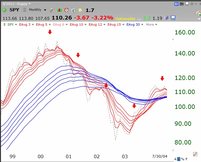
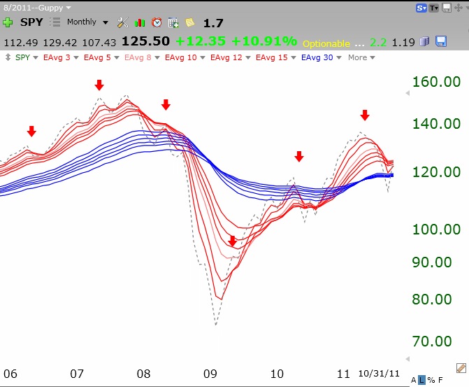
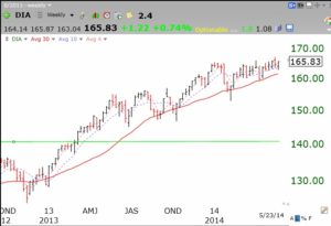
I therefore have adopted for many years   Stage Analysis, the method first advocated by Stan Weinstein in his 1980’s classic book (posted to the lower right of this page).   Stage analysis relies on examining the weekly chart of a stock.   Each bar on the chart represents the high and low of the equity during each week. It is noteworthy that William O’Neil, founder of IBD and a very successful investor, has said that he uses weekly charts to discern the trend.   With Stage Analysis, one plots both the weekly price bar, which shows the high and low of each week, and the 30 week moving average of closes over the prior 30 weeks (usually each Friday’s close).     As each new week is added, the close from 31 weeks ago is dropped as the most recent week’s close is added, thus the average moves along each week.   It turns out that as long as prices remain above the 30 week average and the average is rising, the market is in a Stage 2 up-trend.   As long as the major index ETF’s remain in a Stage 2 advance I leave my conservative university pension in   mutual funds. I do not care what the media pundits are saying, or try to out guess Mr. Market.   (This does not stop me from trying to beat the market in my trading accounts, by exiting and entering even during a Stage 2 advance.)

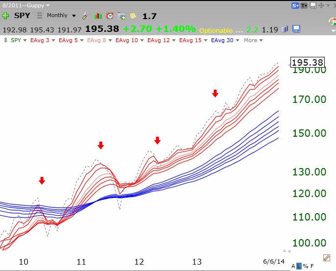
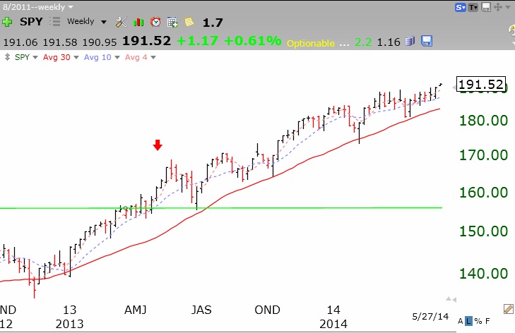
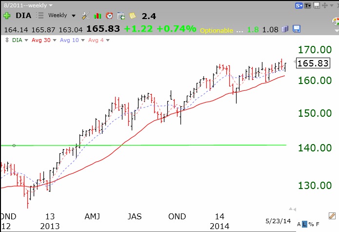
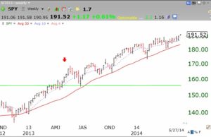
With the above as a context, what does Stage Analysis say about the market over the past year?   It is clear that the SPY (S&P500 index ETF) and DIA (DJ-30 index ETF) have been in a steady Stage 2 up-trend since early 2013. The solid red line is the 30 week average.

SPYwkly05272014


DIA05262014
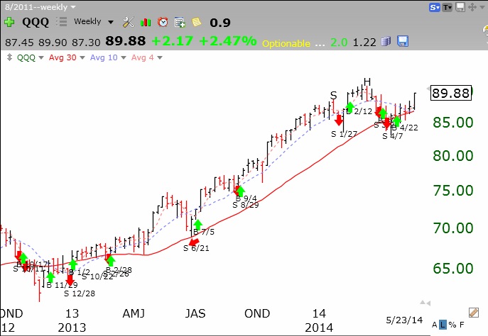
Stage 2 in the QQQ (Nasdaq 100 ETF) really started going strongly a little later,   in mid 2013.

QQQ05262014

All three of these indexes are clearly now in a Stage 2 up-trend and remain above their rising 30 week averages.   The pundits are bemoaning the fact that the past few months since the beginning of 2014 the indexes have been relatively flat. These indexes are all up over 30% since 2013 and the pundits seem to think that they should always be climbing at this super rate!   No!!!   A health market rises and consolidates over and over again.

So I remain invested in   mutual funds in my most conservative pension accounts and ignore the ever present cacophony generated by the media pundits.     I once heard Steve Forbes say that his grandfather told him it is much easier to make money from the market by selling advice.     Hence the plethora of writers and market prognosticators who have rarely walked their talk………..

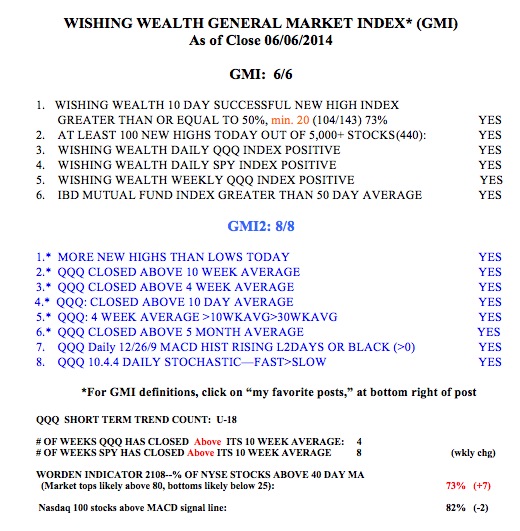
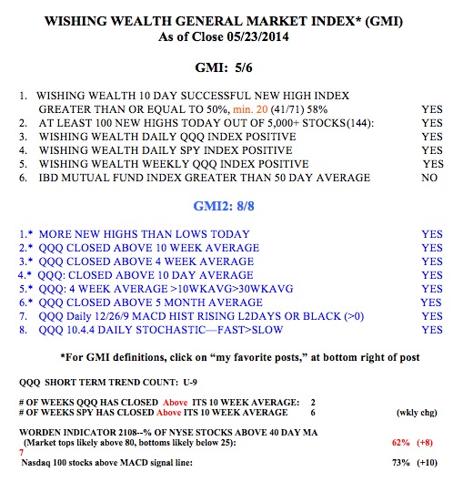
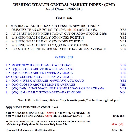
Now back to my trading oriented numbers. The GMI statistics remain strong, with a Buy signal in place since 4/22.   My short term trend count for the QQQ is U-9, 9th day of the current short term up-trend. The people at IBD still call the market in a correction, as they wait for a strong volume up day (follow through day).

GMI05232014


Yes, one can time the market!; IBD 50 lists outperform on gainers and decliners

GMI6/6
GMI-27/9
T210848%

The media pundits say it is impossible to time the markets.   By making investing appear complex and beyond most people, they protect their jobs and the jobs of many financial advisers.   I have been able to use a few simple indicators to keep me out of the major market declines.   I protected my pension from the 2000-2002 and 2008 declines. Below is a chart showing the periods when the GMI was on a sell signal (in red) versus a buy signal (green) since 2006.   The GMI, a collection of six indicators,   has helped me to get out of the market during the major declines.   Yes, there are   times when the GMI gets whip-sawed, but only for a few days.   I so not mind going to cash and then re-entering on a new buy signal in my trading accounts.   The problem is that my pension plan prevents me from market timing.   They want me to ride the market down in a large decline.   I refuse to do so. Below is a graph of the GMI signals as they apply to the QQQ. Click on it to enlarge.   Judge for yourself if you would have preferred to be out of the market or more defensive during the periods of red days. You can also check out the strategy of using GMI signals to trade QLD the past two years here.

GMIQQQperfOne of my perspicacious honors students questioned my analysis of the IBD 50 stock lists’ performance during the period since the last GMI buy signal, which I posted a few weeks ago.   He suggested that while the IBD 50 stock lists might have had more large gainers than the stocks in the major indexes, perhaps the IBD 50 lists also had more big decliners.   So, I am re-posting below the table I posted a few weeks ago, with the addition of a new column (in red) showing the percentage of the IBD stocks that declined 10% or more in the study period. The data do not support his hypothesis.   I found that 2%-10% of the stocks in the IBD 50 lists declined 10% or more, not very different than   the NASDAQ 100 stocks (8%), but a little more than the Dow 30 (0%) and the S&P 500 stocks (3%).   Furthermore, there were very few of the IBD 50 stocks that declined as much as 15%. So we are left with the conclusion that the IBD 50 stock lists were much more likely to contain stocks that had large gains (more than 20% or 30%)   but are not more likely to have large decliners. Thus, the IBD 50 lists were more likely to contain stocks that outperformed, at least during the period I studied.   Nevertheless, I do know, and IBD has said this, that the IBD type   growth stocks do tend to decline more than other non-growth stocks during major declining markets.

IBD50perfrev

Finally, here is this week’s GMI table. While all but one of my indicators are positive, I am aware that investor sentiment is getting quite optimistic.   (But the Worden T2108 is only 48%!) Until this extreme bullishness translates into low GMI readings, I remain 100% invested in mutual funds in my conservative university pension accounts.

GMI12062013