Stocks with high volume GLB may rocket higher: $SITM, $FVRR, $PTON, $REGI–buy stocks breaking to all-time-highs with high volume–visible on weekly charts

GMI2/6
GMI-26/9
T210829%

Launched rockets find support at 4 week average (red dotted line). Green bars designate bounces up off of 4 week average as long as 4w>10wk>30wk. I buy after a green bar and put first stop loss below that or prior week’s low. Easy to find GLBs with TC2000.

This week will determine if tech down-trend will continue. Monitoring GLBs to find leaders during a correction–$PINS, $PTON, $CRWD; Follow the weekly chart $ZM, $FVRR, $TSLA

GMI1/6
GMI-23/9
T210823%

The GMI is 1 (of 6) and Red and IBD has called the market in a correction. IBD enthusiasts are looking for a follow-through day (FTD) this week. After a possible bottom, an FTD would occur if one of the major indexes were to close 1%+ higher on greater volume than the prior day.  Investors.com and MarketSmith will tell us when an FTD happens. I am looking for a close of the QQQ back above its 10 week average (currently 273.13). QQQ has rebounded exactly to just below its 10 week average. Both the SPY and DIA are weaker and further below their 10 week averages. When the short term trends are down, it is more difficult  to make profits by betting on the long side. You get shaken out repeatedly, at least I do.

However, we know that market leaders are born during corrections. They build bases and even break out of bases to new highs sometimes,  before the market turns up. Mark Minervini (@MarkMinervini) emphasizes this point often.  I always watch the daily and weekly New High lists to look for promising stocks. A stock that has an above average volume break-out above its green line peak (GLB) to an all-time high is worth monitoring to see if it can hold above its green line. That is why I am watching $PINS, which had a beautiful GLB last week. $PINS is also a recent IPO, and has huge projected earnings for 2021 on MarketSmith,  both promising characteristics of new leaders. PINS was one of the stock picks selected by the head of TickerMonkey, one of the speakers at Saturday’s extraordinary free online Boston IBD Meet-up. Also speaking at the event was the brilliant mathematician and stock analyst who writes @TMLTrader (TML=true market leader). His tweets are a wonderful source of promising stocks and he has partnered with TickerMonkey to offer a subscription to his TML portfolio picks.

Look how $PTON has climbed after its high volume GLB in May. Note how it is climbing recently on above average weekly volume.

Once a GLB has occurred I sell if it closes back below its green line. Once it has proven itself and has moved above its green line, a good time to sell is when it closes below its 10 week average (blue dotted line). I find that focusing on daily charts often causes me to exit a winner too early. A rule I have posted on my screen: BEFORE SELLING, LOOK AT WEEKLY CHART.

Look at the leader, $ZM. Only one weekly close below its 10 week, in August,  since its GLB last March. Note the successful retest of the GLB in April. How easy it looks in 20/20 hindsight! Sometimes I think I should tune out everything (news, social media, opinions)  and just program the computer to trade using a few simple rules.


$FVRR has never closed below its 10 week after its GLB in May. (It surely will if I decide to buy it!)

The key for me is to buy rocket stocks soon after they have a GLB and to monitor them on a weekly chart.

Other than 5 weeks during the COVID decline, TSLA has closed all weeks since November above its 10 week average. Note how often it closes above its 4 week average (red dotted line). If I use a strategy based on a weekly chart, I must wait until near the close on Friday afternoon to know whether a moving average will be violated. Many times the average is violated during the week only to close the week above it. Why is that? Do large buyers come in at the end of the week?

Here is a recent IPO that had a retest of its GLB. Will CRWD retake its ATH reached 4 weeks ago?

The GMI remans at 1 (of 6) and Red. With this market weakness as a background I am prone to selling out long positions at the first sign of any weakness. It is so much easier for me to trade profitably when the GMI is Green. T2108 reached a low of 13% last week but closed at 23%. When T2108 is below 10% it usually signals an extremely oversold market and a likely bottom. I always urge my students and never have the courage to do it, to buy some $SPY when the T2108 is in single digits. The depressing news and steep market decline at those times usually scare me from doing so.


New freshmen class and possible online workshop! How I use Bollinger Bands and how this indicator foreshadowed this decline; Just a brief shake-out? Short and long term trends of the market remain up

GMI4/6
GMI-23/9
T210855%

My new online class with 100 freshmen began on Friday. What a wonderful privilege to teach the next generation how to ensure their financial futures! Thanks to Mark Minervini (IBD), Irusha Peiris (MarketSmith) and Michael Thompson (TC2000) for making my class possible!!

Many of my students will be watching this blog and I will therefore take the time today to explain some things in more detail. Many people have asked to take my class and I have always responded that  it was only open to a small group of university students. I have arranged with the university to offer a noncredit online workshop to all persons worldwide who wish to enroll. I will announce the workshop in a few months. It will likely be 10 2-hour sessions, once a week, in the evening. There will be a fee paid directly to the university and  my research center on substance abuse will benefit from the proceeds. Stay tuned.

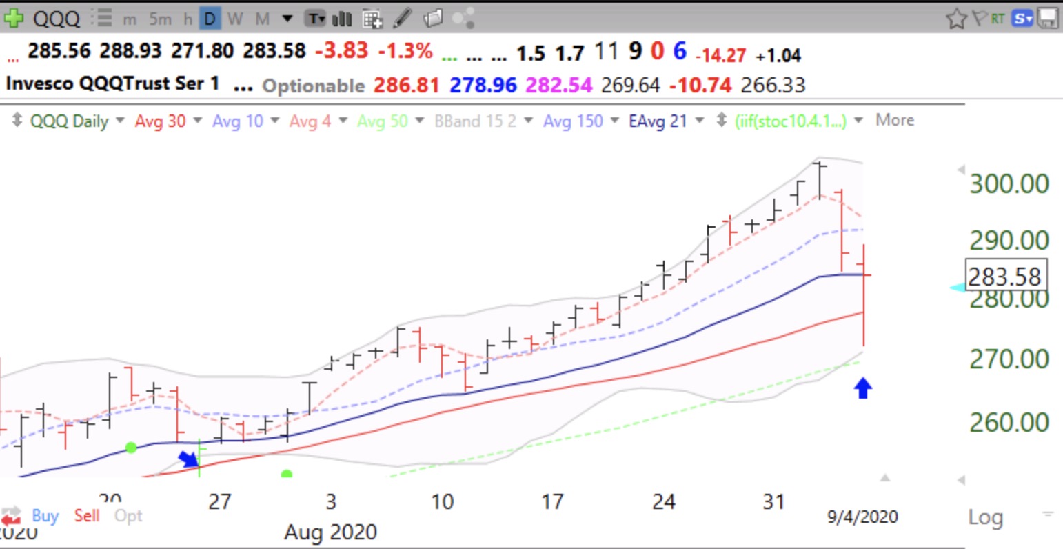
One of the most important indicators I put on my daily charts is Bollinger Bands. These bands create a 95% confidence interval around a moving average. I use a 15 day average and the lines are drawn 2 standard deviations above and below that average each day, yielding the 95% prediction. All you need to understand is that almost all prices will remain within these 2 bands and when a price moves outside it often times comes back in, reverting to the average or begins a new short term trend.

The bands are very useful. When a stock has been rising, once it goes above the upper band it can mean the end of the short term rise. However, if a stock has been consolidating, a rise above the upper band can signal a break-out. Similarly the lower band can show times when a stock will bounce up or begin a larger decline.

On Friday, the QQQ and APPL declined to near their lower bands and bounced. A failure of one of these bounces would suggest to me the likelihood of their further decline. The blue arrows show the last 2 times the QQQ has bounced off of its lower BB. An alternative interpretation could be that the indexes found support near their exponential 21 day moving average (blue solid line), an indicator used by many traders. If multiple indicators work, they must be somewhat correlated!  I prefer the BB because I think it works better for me. Notice how the QQQ stays mostly within the bands and think how you might use this phenomenon  in your trading rules..

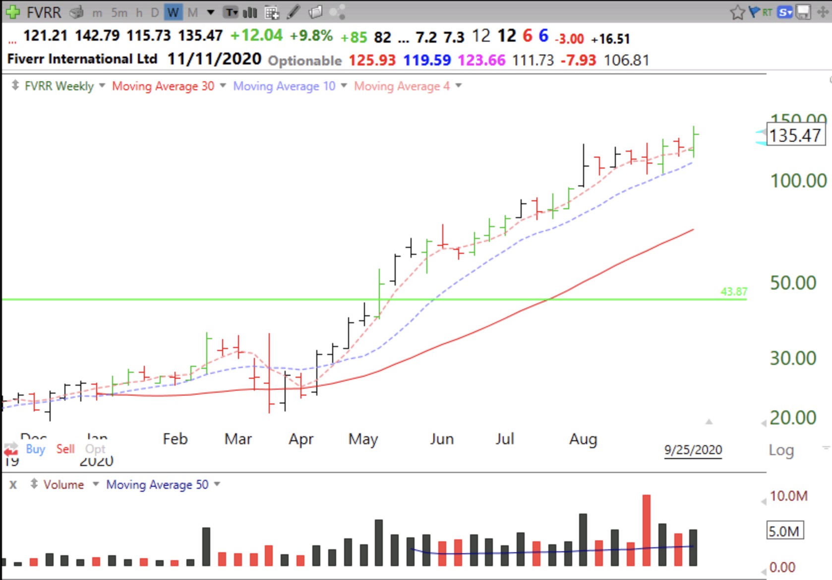
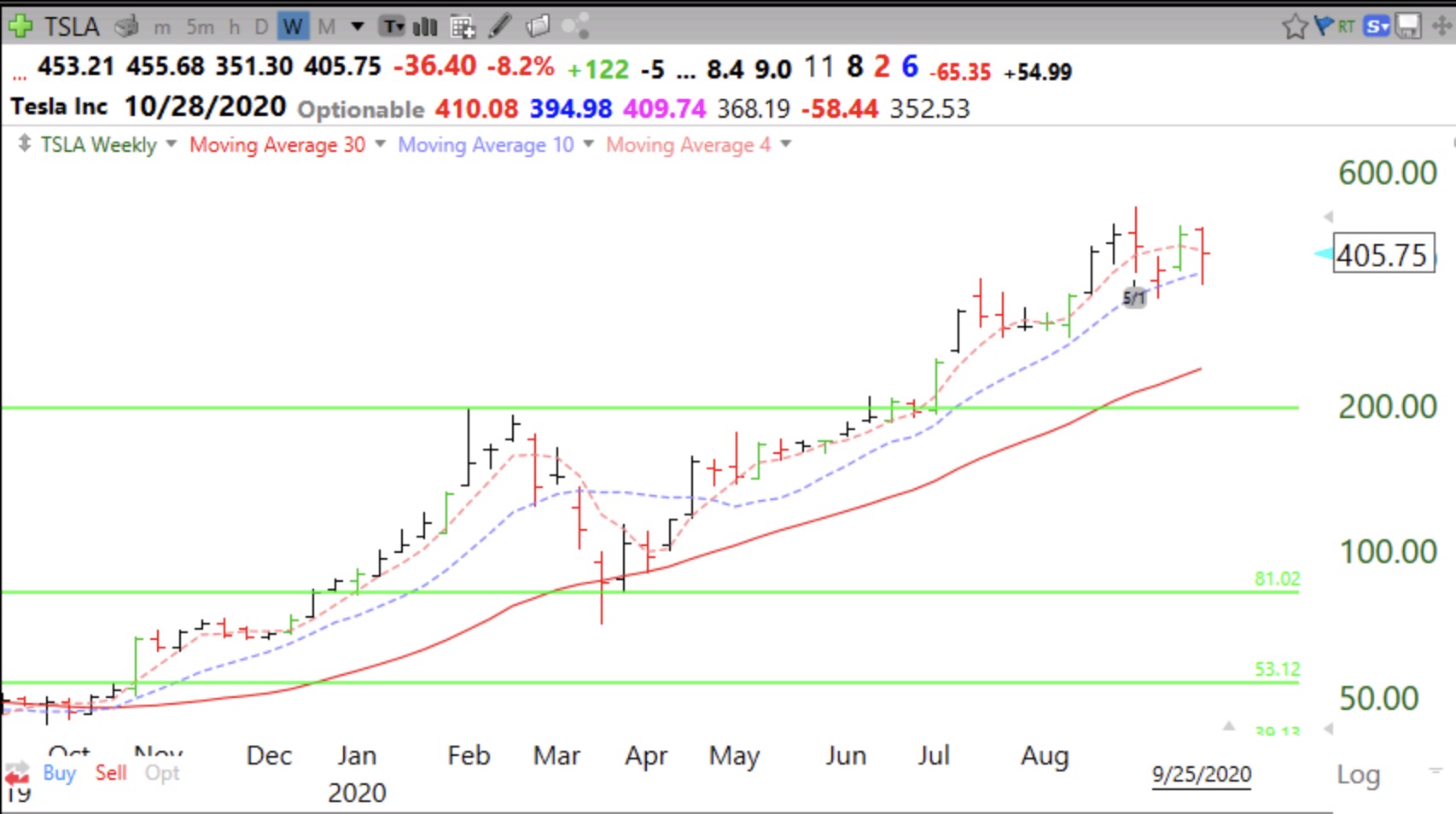
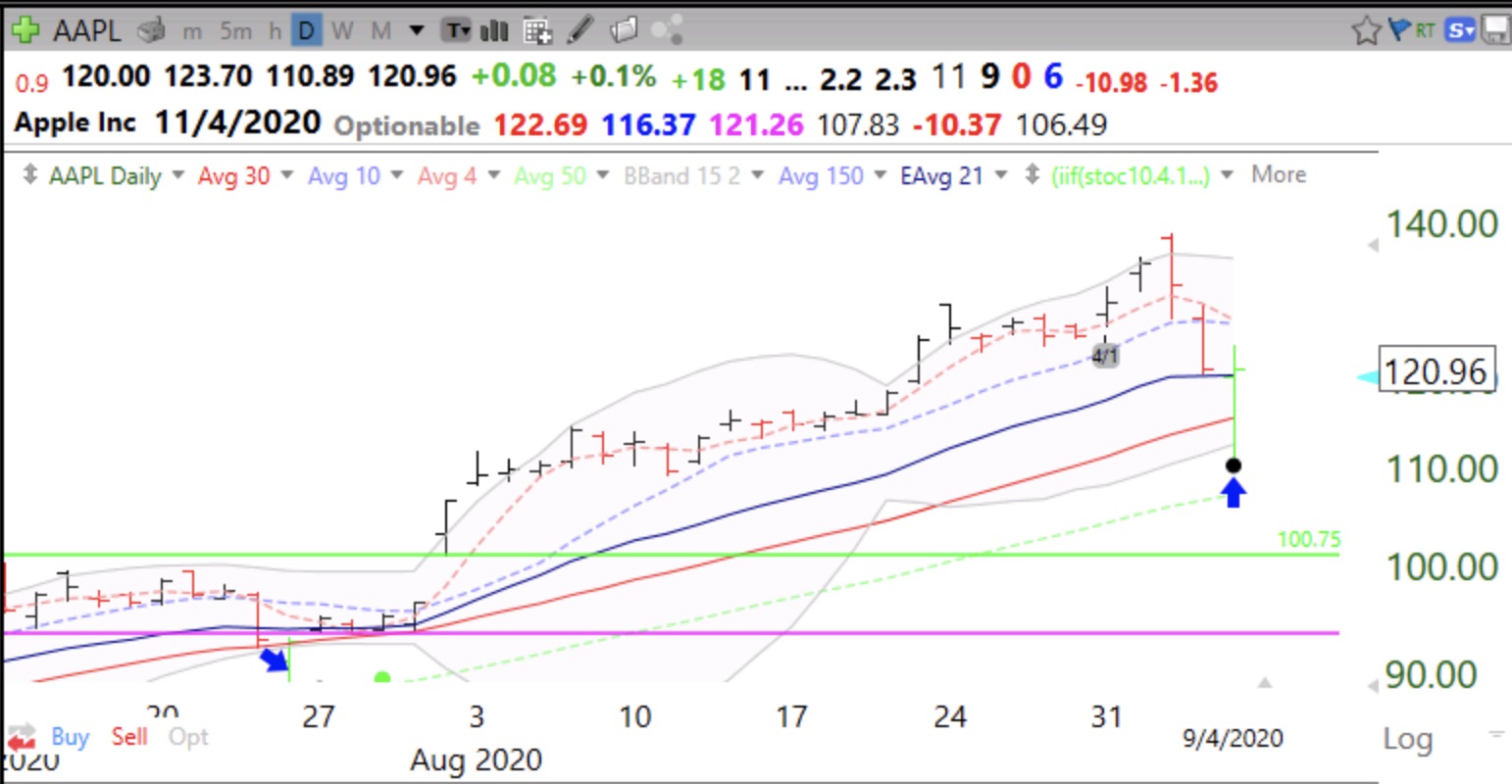
AAPL, which is highly correlated with the QQQ (Nasdaq100 ETF), also bounced near its lower BB. Note that at its recent top, AAPL traded outside its upper BB and reversed to close below it, a sign that it was extended and could decline. The black dot indicates a bounce up off of an  extremely oversold short term condition and the green dot in July represents the possible start of a new short term up-trend which was confirmed by a break-out above the upper band. The two green price bars show a bounce up off of the lower BB. My students learn how to create all of these indicators using the TC2000 charting software, see the upper tab on my blog. My talented former student and current teaching assistant, Richard Moglen, has created a series of youtube videos that you can access.


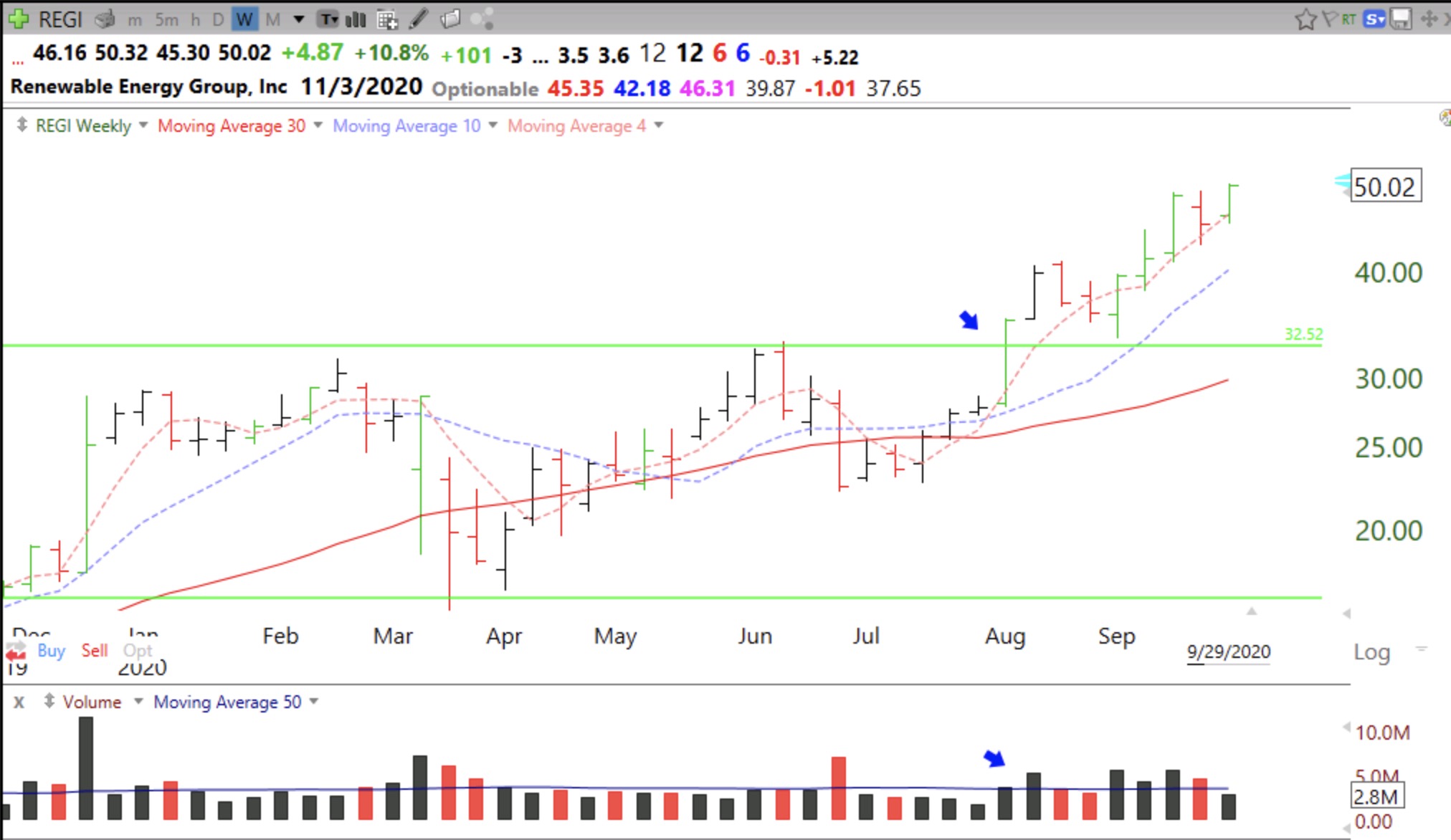
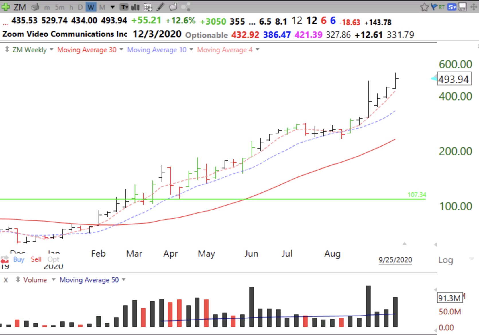
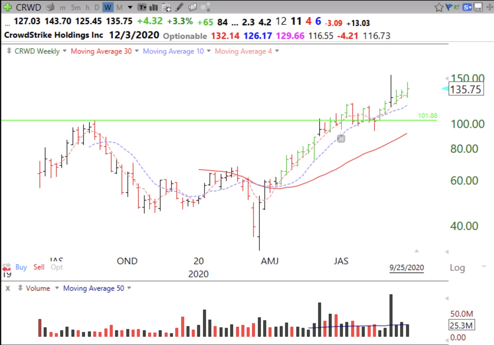
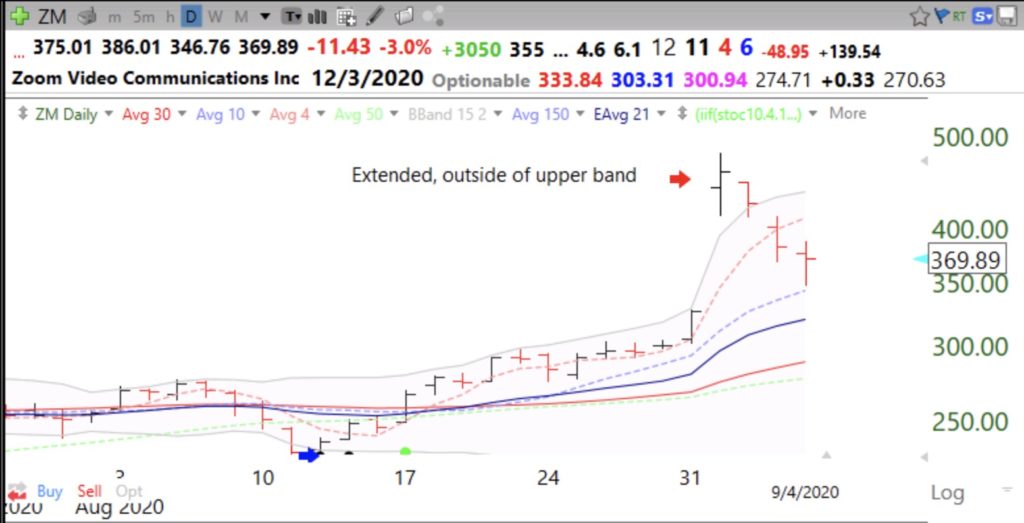
One more example, ZM. The large volume break above its upper band was a sign of ZM’s being extremely extended. I mentioned in a prior post that more than 50% of Nasdaq100 stocks had traded that day above their upper bands. The following day we had that large decline.  Trading stocks without charts is like driving to a place for the first time without Waze!


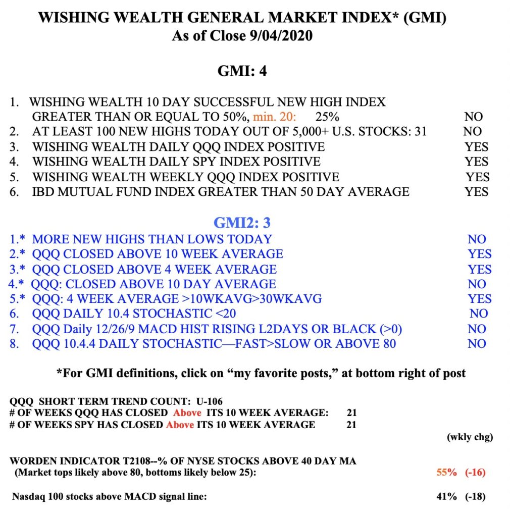
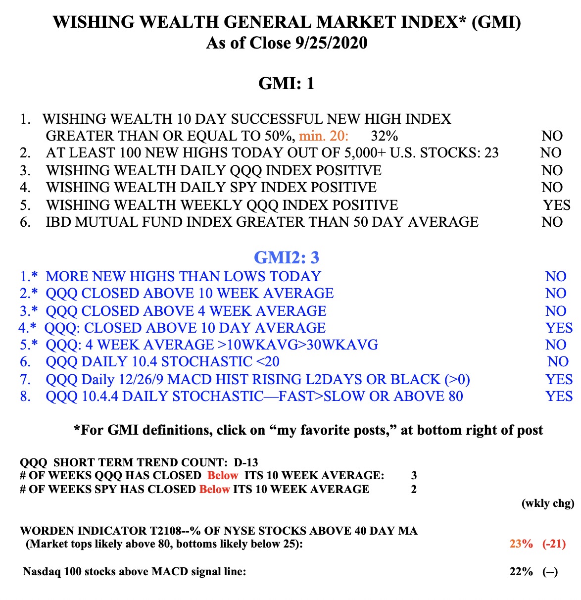
On Wednesday, 56% of the Nasdaq100 stocks traded above their upper BB. On Friday only 2% traded above their BB and 42% traded below their lower BB, suggesting to me at least a market bounce. Meanwhile my $QQQ short term indicator remains in an up-trend at day U-106. The GMI remains Green and is at 4 positives (of 6). The more sensitive GMI2 fell to 3 (of 8). Note there were more new lows than highs on Friday, for the first time since last May. In view of  the extreme oversold condition of the market indexes and the many oversold stocks  on Friday and the  GMI on a Green signal, I have to say that last week may turn out to have been a rapid shake-out in the midst of a continuing up-trend. Enjoy the weekend!!!!!