I spent a lot of time over spring break last week reviewing the market and my technical approach. I gained a renewed interest in the value of daily RWB charts. RWB charts consist of 12 exponential moving averages (see this blog’s glossary for definitions) plus a simple one day average to show the daily close. Daily RWB charts move more quickly than weekly charts and provide possible exit points for stops that are closer to my entry points. Minimizing losses are critical to trading success.
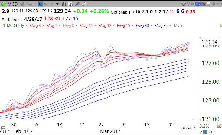
I developed 3 quantitative measures that help me to characterize a daily RWB chart pattern. The total line count (TLC) is a count of the averages that fall into line with the close and each average higher than the next longer average. A perfect TLC of 12 means that the current price is higher than all the remaining averages that are lined up in order below it. This daily chart shows a TLC=12. The dotted line is the daily close.
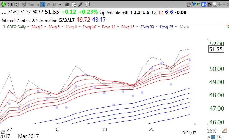
The purple dots show each daily low and provide a way of assessing volatility and support for placing stops. The red line count (RLC) counts the number of the 6 red line averages (shorter averages) that the close is above. It goes from 0-6. The blue line count (BLC) counts the number of blue averages that the close is above (0-6). The top line of this chart indicates that CRTO has values of 12/6/6. (TLC/RLC/BLC) which is a perfect score. Note the wide white space between the rising red and blue lines. This is the pattern of a RWB up-trend. I only buy equities that are in an RWB up-trend.
As a stock starts to weaken, the RLC will quickly decline. A possible first exit or place for me to reduce a position is when the stock closes below all of the red lines and RLC=0, But as long as the BLC=6 the stock is above the 6 blue lines and the up-tend may continue. If any red line crosses below a blue line the white space has disappeared and I must sell the stock. The stock must stay in an RWB up-trend for me to buy or hold it. If the stock registers 0/0 (RLC/BLC) it is another warning to exit.
My strategy is to own strong up-trending stocks that have recently rested and are now resuming their advance. I look for stocks in an RWB up-trend which have recent oversold indicators. In addition, the RLC must currently be back to 6 (of 6) and leading all 12 averages higher. The TLC must also be at 12, ensuring that it is an RWB pattern and all averages have lined up perfectly. My TC2000 scan finds such stocks by identifying those that have had a lower Bollinger Band bounce or low stochastics in the last 5 days plus a rising relative strength versus the S&P500.
Two Dow stocks meet these criteria now, MCD and MSFT. I will just show MCD as an example, never as a recommendation. MCD is a 12/6/6 (TLC/RLC/BLC) but had low stochastics within the last 5 days (not shown). If I bought MCD on Monday, likely around 129,34, my first partial exit could be at the lowest red line (currently 128.39, on second line in above chart). A close below its top blue line (127.45) would be a greater sign of weakness. If a red line declines into the blue lines, the RWB disappears entirely and I must exit. What I really like about this approach is that my exit/stop points can be quite close to my purchase price. Note that MCD has not closed even once below all of its red lines since late January! The purple dots show a few times where the daily low closed in the white space but the stock always closed back within the red lines. It may therefore be preferable to avoid such whipsaws by employing mental stops and assessing each position for a signal near the close each day.
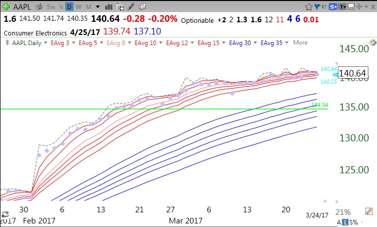
AAPL has also never closed below its red lines since January, but it has weakened a little to a 11/4/6. For now, its RWB pattern remains very much intact.
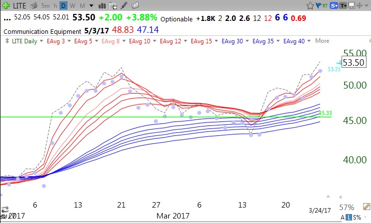
Recent GLB, LITE, has a rebounding 12/6/6 RWB pattern after retesting its green line. My scan would have picked it up lower, below $50.
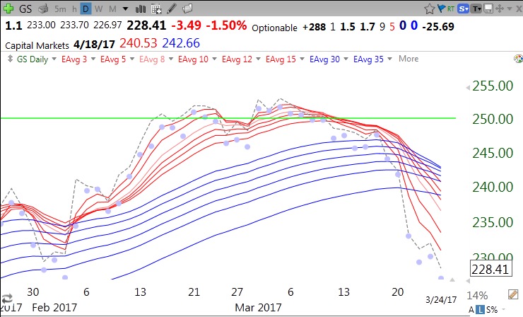
GS provides an example of how a stock’s up-trend turns into a down-trend. GS is now a 5/0/0. This method might have gotten me out around 246 when the RWB pattern disappeared, or earlier, around 250, when the white space was first encroached by the daily close. Note also the entry set-up last February when RLC=6 after weakness.
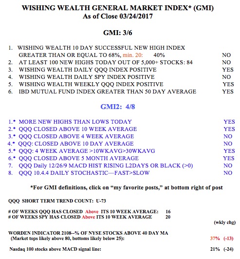
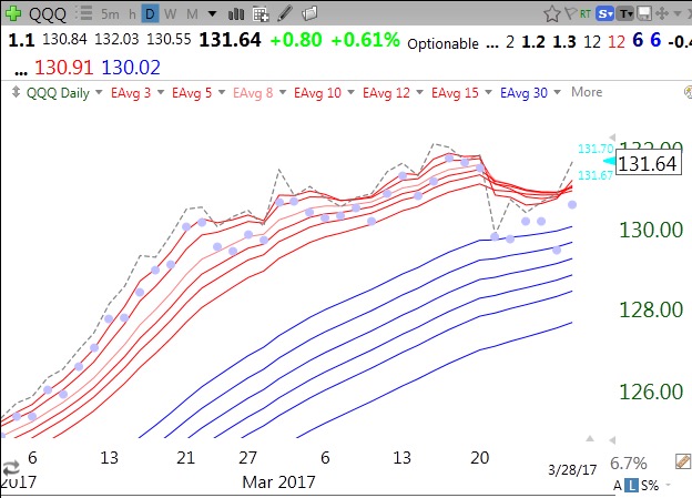
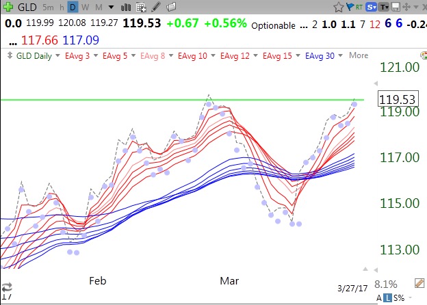
This technique also works well for me to analyze ETFs and market indexes. The current readings for the major indexes are: SPY 6/0/3, DIA 6/0/4 and QQQ 9/1/6. Thus the SPY and DIA have both closed below all of their red lines but are still above 3 or 4 of their blue lines. Their RWB advance is over for now. The QQQ is above 1 red line and all of its blue lines and still has a RWB pattern. Below is SPY and QQQ.
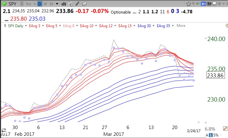
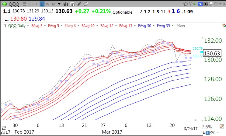
So the QQQ remains in an RWB up-trend pattern, though it has weakened. Note that it closed above all red lines much of the time since February. The SPY (and DIA) are wounded and if their BLC turns 0, it will suggest at least a likely short term decline. A BWR decline pattern could suggest much more weakness………
Because of its focus heavily on the QQQ, the GMI remains Green. The QQQ short term trend count is U-73, and approaching the longest such up-trend since 2006, which ended at 88 days (U-88). The end of this QQQ short term up-trend is likely imminent, but it is better to react to a technical signal than to try to act in advance.