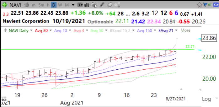
Daily chart shows that NAVI broke above its green line top on above average volume on Friday. It is 2.6 times its price a year ago.
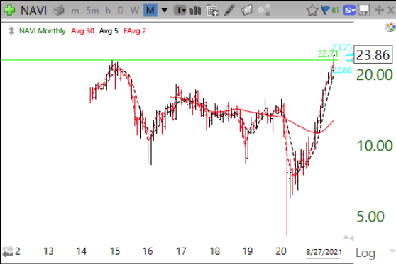
Monthly chart shows that NAVI peaked and formed a green line top in December, 2014.
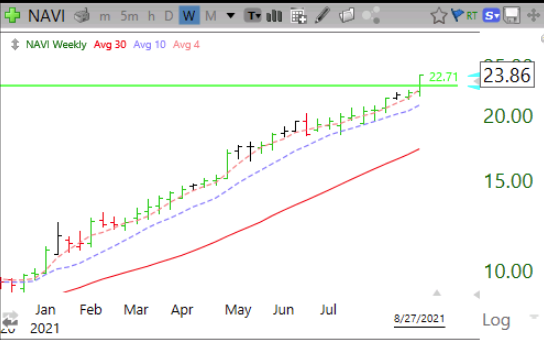
Weekly chart shows that NAVI has closed above its 10 week average (blue dotted line) since December 2020. It is a consistent yellow band stock with its 4wk>10wk>30wk averages.
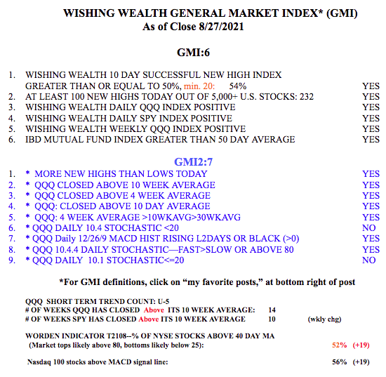
The GMI is at 6 (of 6) and Green. I am still concerned that September could fulfill its reputation as the worst month for the market. Check out my TraderLion conference presentation listed on the topics/webinars tab at the top of this blog page.