The old saying is Go Away in May and Come Back at Halloween. This is because many academic studies have shown that most of the rise in stocks each year occurs between Halloween and May., The market has climbed this year since May, however.
I think there was a good reason that William O’Neil’s books usually showed weekly charts. Daily charts are much more volatile and lead to more trading whipsaws. Weekly charts show the major trends more clearly.
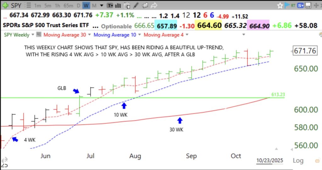
This weekly chart of SPY (the pattern for QQQ, not shown, is similar) shows what I have found to be the classic pattern of an up-trend. The 4 week average is rising above the rising 10 week average which is above the rising 30 week average (indicative of a Weinstein Stage 2 up-trend). Note the GLB (green line break-out) to an ATH (all-time high) in June. Since then, SPY has only closed the week below the 4wk average twice and then bounced up off of the 10 week average. A weekly close below the 4 or 10 week average could be a significant sign of weakness or of a change in trend. With stocks and indexes, I find that a week that ends with a bounce up off of the 4 wk average can be a possible buying point.
Such bounces up off of the 4wk average are shown in this chart by green price bars. One might buy after a weekly bounce up off of the 4 or 10 wk average and place a stop loss below the low of that week. If the stock closes the week below the 4 wk average, I might place my stop below that week’s low. To use this setup one would wait until Friday to ascertain where the week’s close is likely to be. This setup frees me up from having to watch the market all day. I urge readers to build this chart layout and analyze the stocks they have been trading. Regardless of the setup used, it may indeed prove profitable to be invested long this Halloween. Let’s see how the market looks at 3:30 Friday.