Green Dot strategy defined

GMI6/6
GMI-28/9
T210848%

I have learned over the years that I have more success trading strong up-trending stocks that are turning up after they have had a small decline than buying break-outs. I find that if I think a stock has bottomed and turned up, I know exactly where to get out if I am wrong–if the recent bottom does not hold. I therefore can take a position and if I am wrong can exit with a small loss–that is the secret of success in this business–many small losses and a few large gains. I use a 10.4.4 daily stochastics indicator to find stocks that may be resuming their up-trend. I look for stocks in an up-trend where the fast stochastics (10.4) has recently crossed above the slow 10.4.4 stochastics, or signal line. I like the cross to occur at an oversold stochastics value, below 50. My co-instructor, David, has written a small program in TC2000 for our students to use. It places a green dot on the chart on the day the cross-over occurs and places the dot at the 5 day low as a likely support level.  I also add  this logic to one of my TC2000 columns so I can quickly locate stocks in any watch list that have a green dot.

I have found the Green Dot strategy useful for trading the market indexes as well as individual stocks and ETFs. Green dots can occur in declining stocks but many of them will fail. I therefore first make sure the stock is in a strong up-trend using the RWB daily or Yellowband techniques (see blog glossary). Any stock I buy must also be trading above its rising 30 week average (Weinstein Stage II). A pattern of rising green dots is preferable, but not necessary. If I buy a green dot signal, I must exit quickly if the stock closes back below its green dot or the fast stochastic closes back below its signal line. If my trade set-up fails I exit.

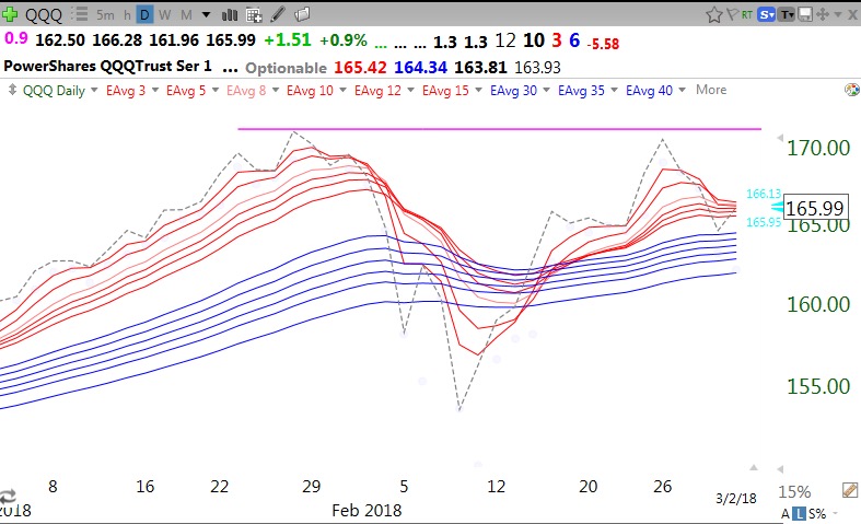
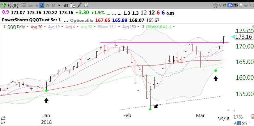
Here is a chart of the QQQ. The black arrows point out the green dots. The DIA and SPY also had green dots last week, foreshadowing the advances we had. (The QQQ pattern looks like a cup with handle break-out!)

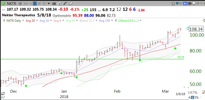
Here is an example of how green dots have performed for $NKTR


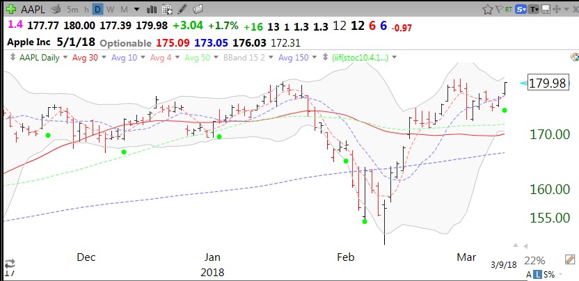
And AAPL (note that some signals did not work out as well as others)

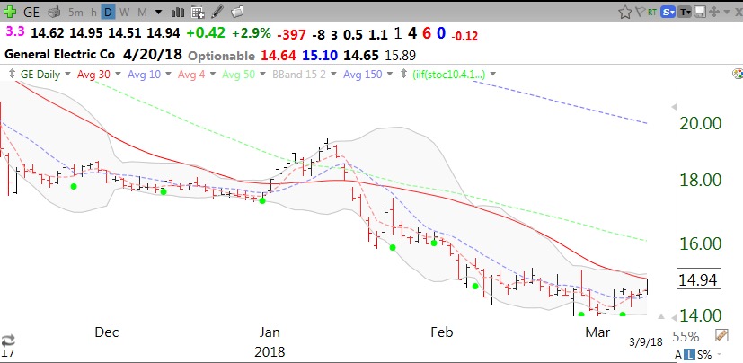
Green dots do not work well with a stock in a down-trend.

By the way, I try not to rely on a single indicator to make a decision. It is always best to look at other indicators (MACD, Bollinger Bands, moving averages) for confirmation of a buy signal. One should also plot the stochastics itself to see the level at which it is crossing. It takes 14 weeks to teach my undergraduate students these strategies! Let me know how the Green Dot strategy works for you…

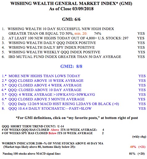
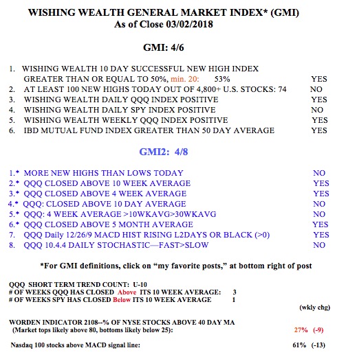
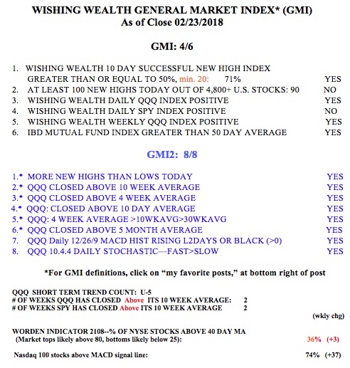
The GMI is a perfect 6 (of 6).


Rising interest rates suggest market to form top

GMI4/6
GMI-28/9
T210836%

I have been trading in the market since the 1960s. Over that time I have witnessed many market cycles. The late perspicacious Martin Zweig published a book that educated me about the force that the Federal Reserve’s actions exert on the markets. After the Fed raises interest rates several times the market eventually declines. I observed that when interest rates rise, there is typically a market decline and afterwards people, ever optimistic, believe that the market can survive rising rates or they won’t continue to rise. At some point, however,  investors eventually surrender to the rising rates and the market enters a sustained decline. We are now in the period after the bull market euphoria has been dissipated and people are turning their attention to interest rates. Pundits want to believe that the short correction is over and the bull market will resume. Still, every move and utterance by the Fed members will be scrutinized for an indication of how much and how rapidly they will raise rates. The Fed has to raise rates because they had to lower them to historic levels to bring the economy back from the horrendous debacle of 2007-2008. As the economy recovers they want to normalize rates and get most of the bonds they purchased to bring down rates (quantitative easing) off of their balance sheets. The resulting increase in the supply of bonds will reduce bond prices and raise interest rates.

As a psychologist and a chartist, I have found that the best way to predict behavior is to study the behavior itself. I therefore monitor a number of treasury bond ETFs as a way of understanding what is happening. I usually provide daily or weekly RWB charts (see glossary for definitions) to show trends. However, with the bond ETFs, I look at long term monthly RWB charts to see the major long term trends. I do not want to scare you, but these charts tell me that the multi-year RWB rise in bonds and corresponding decline in interest rates is over and bonds may be entering a significant BWR down-trend pattern. Note the huge RWB pattern in SHY through about 2013.

This chart zooms in on the recent past and shows the RWB pattern actually lasted until mid 2016 and now SHY is entering an ominous BWR decline (see glossary) for the first time since at least 2003 (as far back as I have data). Given that this is a monthly chart, it suggests to me that this trend could persist for months if not years.

Rather than looking at bonds to discern rates, TC2000 also offers a chart of the short term interest rates themselves. This monthly RWB chart shows the Fed reducing rates after the collapse of the internet bubble in 2000, then raising them again until the 2007 housing related crisis when they lowered them tremendously through 2015. Now look at how rates have been rising so much that they now form a steep RWB up-trend.

If we are indeed entering a period of a persistent decline in short term bonds and a rise in interest rates, the market may be forming a long term top. The lure of higher rates will eventually suck money out of relatively more risky stocks, especially by anxious boomers nearing retirement. With that in mind, I am willing to own some stocks but am keeping one foot out the door so that I will be ready to exit quickly if my market technical indicators should weaken…..

Meanwhile the market indexes are currently rebounding, as shown by the GMI being Green and the SPY and QQQ having closed above their 10 week averages for the 2nd week in a row. Note, however, the paucity of new highs among US stocks on Friday (90). Prior to January 29, there were  more than 200 new highs each day.