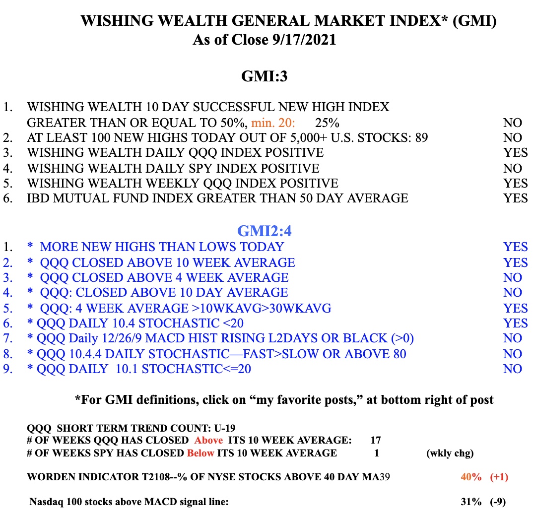
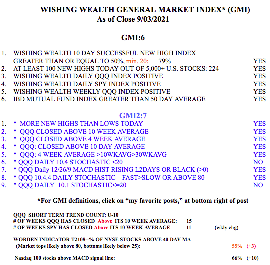
I am surprised that with so many market pundits opining about “weak September” the market seems to be complying. But weak it is, for now. I am looking for the put/call ratio to rise above 1 for a meaningful bounce to occur. It closed at .71 on Friday. So many stocks have failed break-outs, and even TLT did so, suggesting higher interest rates. Now is the time for me to be very defensive, raise stops and make no new long purchases. It is so much easier to make money going long when the GMI is 5 or 6.
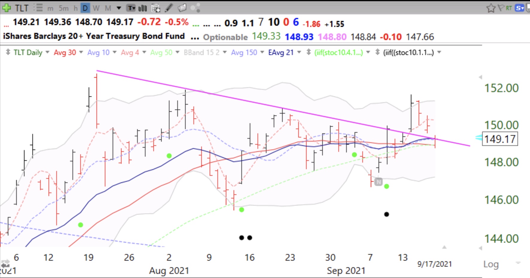
SPY has now closed below its 10 week average.