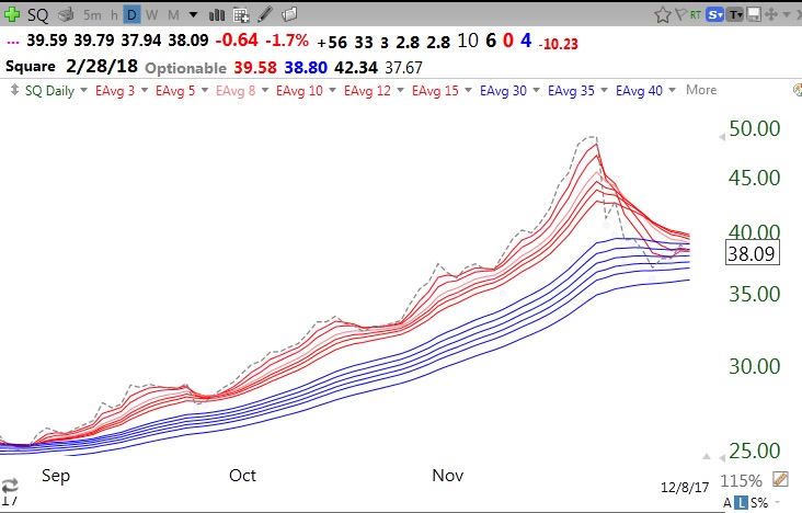
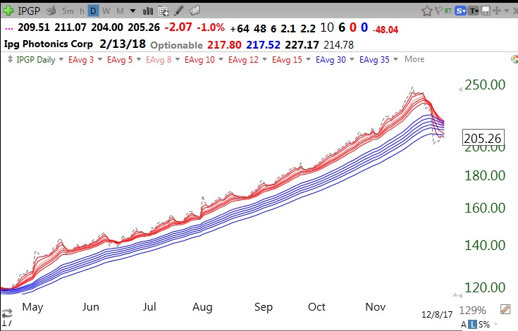
The most difficult decision in trading is when to sell a stock that has advanced after purchase. I like to use modified daily GMMA (Guppy Multiple Moving Averages) charts to guide me when to sell. My modified GMMA consists of 13 exponential moving averages (1, 3,5,8,10,12,15,30,35,40,45,50,60). The “1” period average is a gray dotted line and represents the daily close. The 3-15 shorter averages are red and the longer averages (30+) are in blue. The chart is drawn on a white background. My color scheme is different from Daryl Guppy’s, who invented the GMMA.
A Red White and Blue (RWB) up-trend is when all of the red lines are rising above the blue lines and separated by a white band. The reverse pattern (BWR) is a down-trend. When weekly averages are used it produces longer term trends. For swing trading where I do not want to hold a declining stock very long, I use the daily averages. But I like to focus on stocks that also have a RWB weekly pattern.
The gray dotted line shows the daily close and provides me with an important indicator of a change in trend and a possible time to think of selling. In an up-trend, the gray dotted line will be mainly on top, leading all of the red lines higher. When the gray line closes below all of the red lines it is a sign of weakness and I consider selling or lightening up on my position.
With that description in mind, here are two examples of stocks, SQ and IPGP, that have been in a daily RWB up-trend for months and now show signs that the up-trend may have ended or is at least weakening. A few weeks ago, the dotted line for SQ crossed below all of the red lines. It has not done this since one day in September. Now the white space between the short and longer averages is gone, ending the RWB pattern. Note how long the gray dotted line was above all of the red lines. I try not to sell a stock when the gray dotted line is holding up.
IPGP shows a similar pattern with a signal on 11/29.
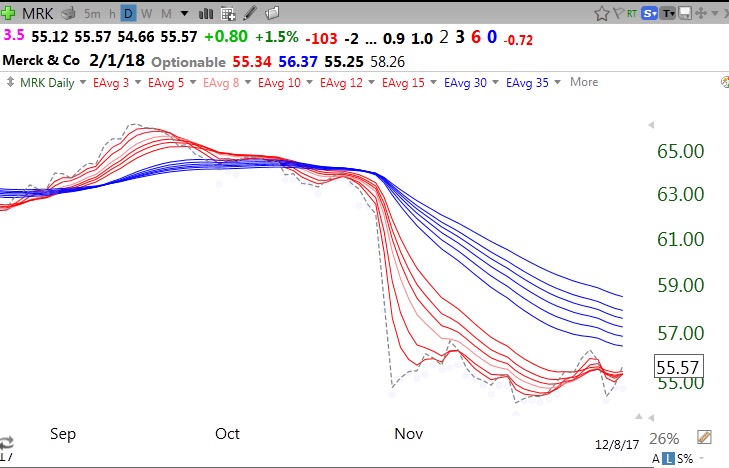
MRK is an example of a Dow 30 stock in a daily BWR down-trend. The sell signal came late September when the RWB pattern disappeared.
Some of my rules: Only go long stocks in a daily RWB up-trend, and consider raising stops, selling or reducing my position when the stock closes (preferably 2 consecutive days) below all of the red lines. Sell the entire position when the RWB pattern totally disappears. Daily closes are stressed for signals because stocks often trade below the red lines during the day but recover to close back above them. I therefore like to trade near the market’s close so I know how the stock will likely close..
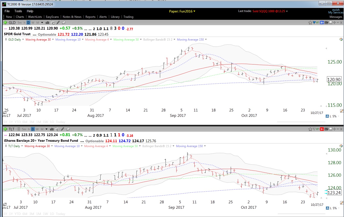
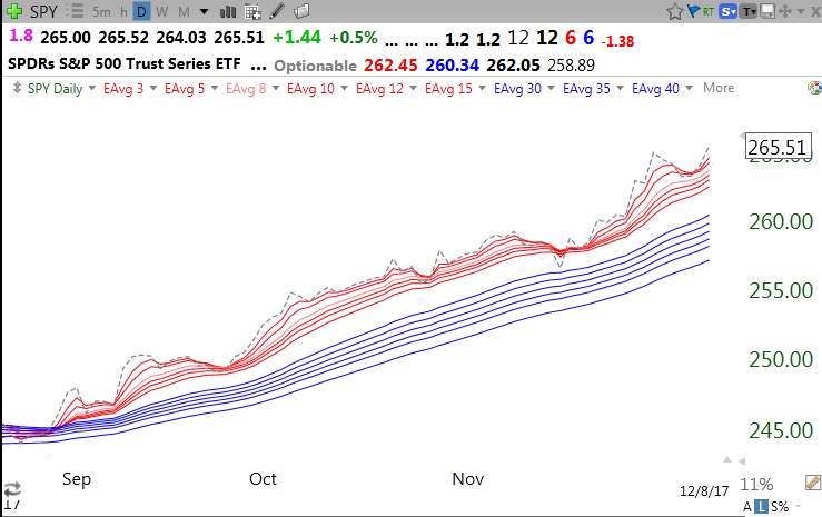
So what pattern is the SPY in now? Not too shabby!!!…
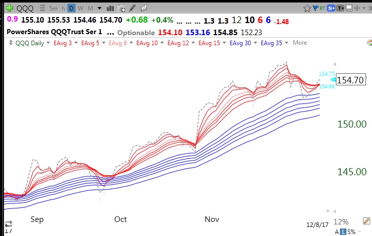
The QQQ just closed back above its red lines. We will see if it holds…
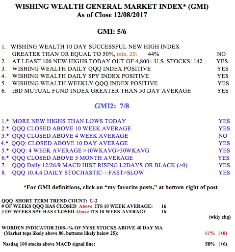
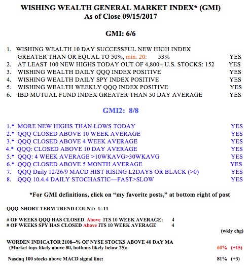
And the GMI, which measures short and long term trends, is 5 (of 6).