Yellowband scan picks up $UCTT, $NVDA, $FSLR, HNH, $LOXO, $EXEL, $NVMI, $CORT

GMI6/6
GMI-28/9
T210860%

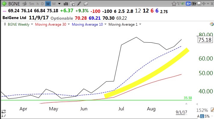
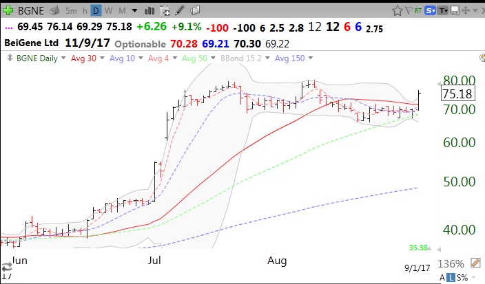
Given my renewed interest in yellowband stocks, I created a simple scan that looks for stocks up at least 70% from their 50 week low, are within 20% of their 20 week high, are in a yellow band pattern and have regained their 10 week average last week. One of the interesting stocks to satisfy these criteria is UCTT. This weekly chart shows that UCTT rose on above average volume last week, is above its last green line top, and may be emerging from a cup and handle base. Note also from the statistics at the top of this chart that its most recent earnings were up +2850% with revenue up +76% and that the stock has already quadrupled over the past 12 months. Its next earnings are to be released on 10/25/2017.

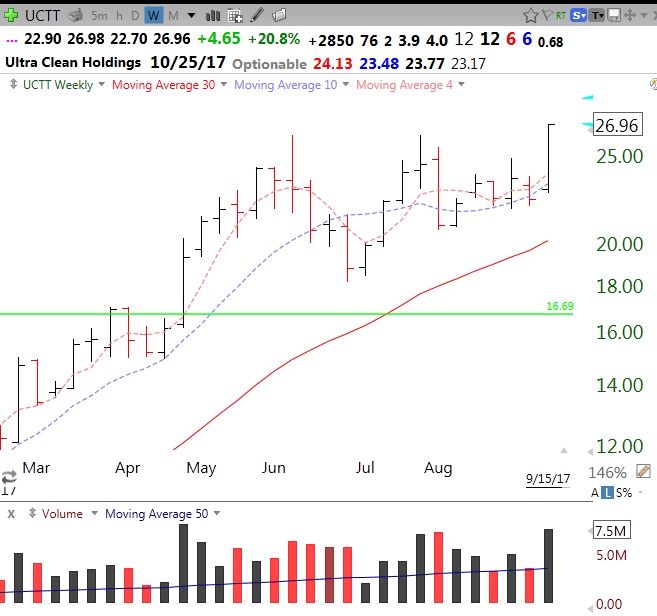
This weekly yellowband chart shows UCTT was in a multi-month yellowband pattern with the stock closing (solid line) above its 10 week average (dotted line), which was above its rising 30 week average (red line). The purple dots indicate the weekly lows and show that the lows each week tended to be above the 10 week average until the stock formed the recent base.

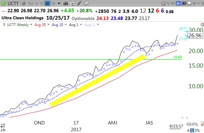
If I bought UCTT based on its yellowband pattern, I would consider selling or reducing my position if it closed any week (or day) back below its rising 10 week average. Other noteworthy stocks to come up in this scan were: NVDA, FSLR, LOXO, EXEL, HNH, NVMI and CORT.

You can run this scan yourself (09162017yellowband…..)  in TC2000 by joining my club and also get some of my other scans. Just go to www.wishingwealthblog.com/club. The glossary on this blog describes the logic of most of the scans. And follow me on twitter @wishingwealth for intraday alerts–all of this information is for educational purposes only, no guarantees of any kind! Remember, most successful traders are only right on about 50% of their trades.

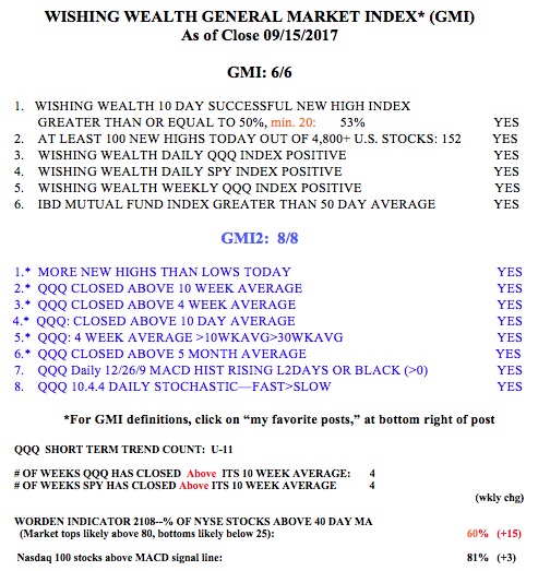
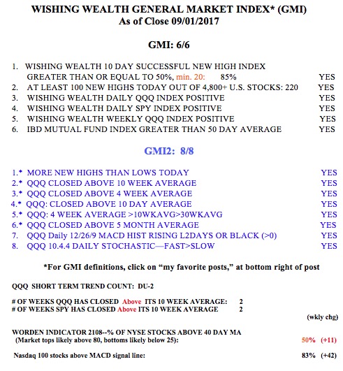
The GMI  is at 6 (of 6) and the GMI-2 is 8 (of 8). I am watching inflation indicators closely to see if the Fed may tighten sooner than everyone expects. That will kill this bull…


$INGN 2014 GLB moving up after taking a breather

GMI6/6
GMI-26/9
T210845%

On December 29, 2014 I posted the following about INGN:

“My great stock picker friend, Judy, knows someone who needs to be on oxygen. Judy discovered that there is a product made that is very mobile, light weight and has a great battery. She claims that it beats the competition and makes a huge difference to people who must be on oxygen. So Judy researched the product and identified its manufacturer, INGN. Judy does very well by picking stocks that have a great concept underlying their product. She bought some INGN.

INGN is a recent IPO and is scheduled to make some investor conference presentations in mid-January.   The stock may therefore be volatile in the coming weeks.   Nevertheless, I bought some INGN. By the way, INGN had a green line break-out in November, consolidated, and then moved up. Check out its weekly chart. It has already doubled.”

INGNweekly

This weekend I was watching TV and saw for the first time an ad for INGN’s mobile oxygen unit. It showed one person bogged down because he was connected to a traditional oxygen unit and another going about town with INGN’s portable mobile unit. Judy told me about Inogen’s  great concept 3 years ago. Unfortunately, I rode INGN for only a short time, much less than Judy did. I was shaken out in 2015’s decline. My mistake was to not buy it back when it recovered and had a new green line break-out at $55.98. One must always continue to monitor promising growth stocks that undergo a decline to see if there is  a new GLB. Check out this monthly chart of INGN. At the time of my post in 2014, INGN was at $30.25. INGN closed Friday at $103.05. Maybe their new advertising campaign is going to breathe new life into the stock. A lot of boomers will need to be on oxygen in coming years–or even after a hurricane…

My experience with INGN shows the virtue of investing in companies with innovative products. A company with a great concept and strong technicals is much easier to invest in and hold for the long haul than an investment based on just a good chart.

The GMI remains at 6 (of 6):


$BGNE: Example of a stock purchase set-up for my new students; GMI: GREEN

GMI6/6
GMI-28/9
T210850%

Last week I had the first meeting of my class of 120 freshmen who are enrolled in my 14 week semester long course on the stock market. Since many of them  will be looking at this blog for the first time, I am focusing today on helping first time users. Here is a set-up I may use for purchasing a stock. I first make sure that the market trend is up. As long as the GMI is Green I feel that the odds are in favor of owning stocks. I then wait for a stock on my watchlist to show a good set-up. Biotech stocks have been very strong lately because of buy-outs (KITE) and exciting clinical trials. A number of them are also presenting results at conferences this month. A good presentation can propel a stock higher. Biotech stocks are very speculative though because they usually have no earnings and a failed trial or sudden death of a patient in a clinical trial can cause a stock to tank. So one would only invest a small portion of their capital in a biotech stock.

With that caveat, BGNE was on my watch list and showed some good technical qualities. First, a monthly chart shows that BGNE is above its last green line top. (A green line is drawn on a monthly chart at the highest monthly price that has not been exceeded for at least three months or bars). In February, 2017, BGNE broke above its green line top (GLB= green line break-out) and then went sideways for several months. In July, BGNE took off on very high volume when it announced a partnership with Celgene. Note that BGNE came public in 2016. New stocks (IPO) that form a base and then make an all-time high (GLB) are often great candidates for purchase. Also, note that my chart shows that next earnings are expected on 11/9/17 and so there will be no imminent earnings release to affect the stock.

Next I look at the weekly chart. I want the stock to be in a yellowband up-trend. That means that the stock is consistently closing above its 10 week average (blue dotted line) which is rising above its 30 week average (red line). If I can draw a yellow band in the space between the rising 10 and 30 week averages, that stock meets my criteria for a rising “yellowband” stock.

Now, the key is to buy such a stock using a set-up, which if it fails, leaves me with a relatively small loss. One never knows which stock one purchases will fail, so it is critical to plan an exit strategy in advance of purchase. One must have a specific technical price/condition that indicates that the trade has failed. For timing the entry, I usually look at the daily chart. There are a number of set-ups I look for to time entry. One of them is a bounce up off of the 30 or 50 day moving average. BGNE last Friday bounced up off of its 30 day average (red line). The prior day it bounced off of its 50 day average (green dotted line). If I bought BGNE because of the 30 day bounce I would exit if the stock comes back below the low of the bounce of the 30 day average (69.29). I might even sell earlier if BGNE traded back below its 30 day average (71.15), yielding a smaller loss.  The key is to sell out quickly if a stock does not act as predicted when one purchased it.

Given BGNE’s multi-month yellowband pattern, if the stock rises for a while, I might sell out only if the stock closes back below its 10 week average on the weekly chart. Big money is possible in holding a yellowband stock as long as the pattern holds. By focusing on daily gyrations, one is often shaken out of a solid yellowband stock. So before selling I first check out the weekly chart. I often tweet my set-ups intraday as they occur: @wishingwealth

The GMI is back to 6 (of 6) and Green.