T2108 and put/call ratio suggest bottom forming;12 stocks at all-time highs last week

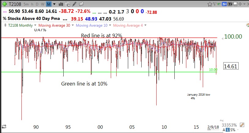
I show my students each semester this monthly chart of T2108 going back to when Worden created it in 1986. (You can access T2108 with Worden chart analysis software.) T2108 measures the percentage of NYSE stocks that are above their simple 40 day moving average of price. The few times since 1986 when T2108 was below 10% the market was severely oversold and did not remain there long. Once, in 1987, it registered its lowest, <1%. I call T2108 the pendulum of the market, moving from extremely oversold to overbought levels. The red and green lines in this monthly chart mark these levels.

Here is a more recent weekly chart of T2108 since 2008.

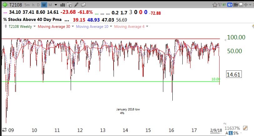
A maximum of one or two weeks below 10% is the norm. On Friday, T2108 traded as low as 8.6% and closed at 14.6%. In addition, the put/call ratio closed at an extremely high 1.27, indicating that a lot of option traders were buying puts and/or insurance against a decline. This ratio is another contrarian indicator with extreme levels of bearishness usually occurring near short term bottoms. The market always bounces after readings above 1.2.

I closed out my SQQQ (3x leveraged bearish QQQ ETF) on Friday with a nice gain. I did not have the courage to follow my rule to buy the market, SPY (I never do!) on Friday  but am looking to make a small pilot buy this week. (This will be a small initial purchase and I will only add to it on the way up if the lows hold)…….

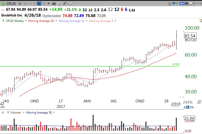
I love weak markets because only a small number of stocks hit all-time highs. Those that do amidst market carnage may turn out to include new leaders when the market turns up. Imagine a stock hitting an all-time high (ATH) last week! These are stocks worth researching and monitoring because someone is accumulating them. Each of these stocks hit an ATH on Thursday or Friday and are above a recent GLB (green line break-out, see blog glossary above):

COLM, ARRY, BLBD, VIRT, WWE, GRUB, PIRS, INST, MC, MCFT, HAE, HLG.

As an example, this weekly chart shows GRUB’s high volume move up last week after beating earnings estimates. I will look for an entry once it consolidates.


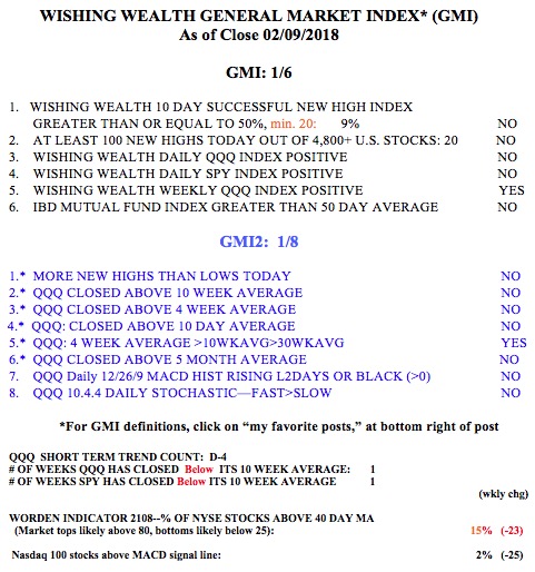
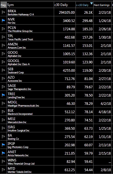
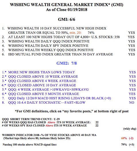
The GMI remains on a Red signal and indicates the need for caution. IBD now sees the market in a correction. Both the QQQ and SPY are now below their 10 week averages, a critical sign of weakness.


Bloody Monday open likely–In cash during this mini-decline

GMI3/6
GMI-23/9
T210838%

I am 100% in cash in my trading IRA account, having reduced holdings the past 2 weeks. I like to do most of my trading in my IRA because there are no tax issues. I can go in and out at will. I remain 100% invested in mutual funds in my pension accounts, where trading is limited.

This is not the time to panic. It is true that bloody Fridays often lead to bloody Mondays when many people decide to exit after pondering their falling balances over the weekend. These people will likely sell to the eager professionals at lower prices. The market indexes I follow have not become oversold. The put/call ratio =.97, showing that option players are not scared enough yet. When the ratio reaches 1.2 or higher we will be near a bounce. Similarly, the daily 10.4 stochastics indicator I watch for the QQQ is at  .47. The market indexes usually bounce around .20 or less. So I expect more of a decline, at least early in the day on Monday.

The chart below is a RWB monthly chart of the SPY. I want to show what the bull market tops looked like in 2000 and 2007. Note that a major decline begins with the index (indicated by the gray dotted line) closing below all of the red line shorter averages. Then the red lines turn down and converge with the blue lines.This pattern takes several months to develop. The RWB pattern (red above blue with white space between them) then dissolves and the red lines move below the blue lines (for ming the opposite BWR pattern).  A quick glance at the current market shows that the RWB pattern is intact and the index (dotted line) remains above all of the rising red lines.

Alternatively, this weekly chart of the SPY shows it to be in a Weinstein Stage II up-trend. It is rising above the rising 30 week average (red line).

I tend to exit the market in my pension accounts when the index closes below its 30 week average and the average begins to turn down. Such a decline last happened in 2016. The 30 week average for the SPY is now at 258.20. Let’s see if the SPY finds support at its 10 week average (blue dotted line), currently at 272.46. The SPY and QQQ have closed above their 10 week averages for 24 straight weeks (see table below). My long term pension money remains fully invested, for now, while my trading account is in cash.

The GMI and GMI2 have both weakened considerably. Two consecutive days with the GMI less than 3 turns its signal to Red. IBD now sees the “uptrend under pressure.”

Why buying stocks over $100 is more profitable

GMI6/6
GMI-27/9
T210868%

This may be the most unique post I have written in a long time. I cannot recall any of the many traders I admire stressing this topic. Over my 50+ years trading I have noticed that I have had more success trading expensive stocks. To understand this idea, we must first dispense with the myth that all that is important in comparing trades is percentage change. I recall that Jesse Livermore, the great trader, once said that he focused on gaining points (dollars) not the percentage he gained or lost on a position. I could not locate Livermore’s exact quote again. The closest quote on this topic I could identify today was one by the great trader and associate of Livermore, Richard Wyckoff:

“If you are trading in 100 share lots, your stock must move your way one point to make $100 profit. Which class of stocks are most likely to move a point? Answer: The higher priced issues. Looking over the records we find that a stock selling around $150 will average 2 1/2 points fluctuations a day, while one selling at 50 will average only one point. Consequently,  you have 2 1/2 times more action in the higher priced stock.”

William ONeil has written that it may be a good idea to take profits on a position that has gained 20%. However, a 20% move in a $20 stock is $4, while a 20% gain in a $100 stock is $20. I have found that if I want to make a pilot buy and pyramid or average up into a full position, it is easier for me to do so in a stock that is rising 20 points than one that gains 4 points, even though the percentage moves are identical. I find that the psychological impact of these two trades on me is different.

As an example, if I buy 100 shares of a $300 stock, like BA (cost=$30,000), I can exit with a small loss of two or three points ($300) if the stock immediately moves against me. If I put the same amount of money in a $30 stock (if one focuses on comparing percentage gain, one has to put the same amount of money in each of the positions being compared), I would be buying 1,000 shares of the $30 stock ($30,000) and losing $1000 for every point that it fell. In reality, I would typically buy only 100 shares of the cheaper stock, thereby reducing my possible risk and profits, at least initially to $100 per point. I am therefore more comfortable managing the trade for an expensive stock.

So does Wyckoff’s observation that expensive stocks gain more points still hold today? Here is a list of the top 20 gainers the past 30 trading days among 4865 US stocks in TC2000. The column C30 shows the closing price of each stock 30 days ago and the next column (C-C30) shows the total dollars gained by the stock last Friday since 30 days before. All of these stocks gained more than $54 in the past 30 days. It is clear that 85% (17/20) of these large point gainers were priced at $100 or more 30 days ago,  before this gain occurred. The 3 exceptions were less but not cheap: SAGE (89.79), MDGL (46.30) and WINS (82.94). The third column shows the expected next earnings date, an important piece of information for me to always be aware of. No matter when I have repeated this analysis the findings tell the same story. In fact, 95% of the next 20 top gainers the last 30 days (not shown) were over $100, 30 days ago. The same relationship occurs for ETFs.

My conclusions:

If I plan to buy a stock or options, I will have a better chance of having a large dollar gain if I focus on stocks that meet my purchase set-up criteria and are expensive, at least $100 or more. I love to use this strategy with call options, which usually cover 100 shares,  because if my timing is correct, the stock and the option could gain many points.

There are a number of reasons why I like expensive stocks:

  1. They are trading over $100 probably because big money/institutions bid them up;
  2. They are probably harder (more expensive) to manipulate/whipsaw than cheap stocks;
  3. I have time to accumulate a posiiton in stages as it rises;
  4. There is a smaller universe of stocks over $100 to monitor;
  5. I typically can make more money when I am right;

All of the above, of course, assumes that I have excellent rules for quickly exiting a losing position, because high priced stocks can drop many points more quickly. By the way, this strategy is antithetical to most inexperienced traders’ dreams of buying cheap stocks that will rocket to the moon…..

The GMI remains at 6 (of 6).


My honors seminar on technical analysis for undergraduates begins this week. I am looking forward to sharing all of these ideas with a new class of brilliant students.