"This is one of the easiest gauges to keep up and yet is the most important one. When the Dow breaks below its 30-week MA and breaks down into Stage 4, it’s time to become very defensive. Suspend buying even if you see a few stocks breaking out on their charts. Be sure to sell any stocks that are showing poor relative strength. Pull up your protective sell-stops as tightly as possible on your few remaining long positions. Finally, start hunting for ideal short-sale positions. While this key long-term indicator certainly isn’t infallible and will give an occasional whipsaw signal, it is incredibly reliable. No bear market in the past several decades has unfolded without this gauge flashing a negative signal.
Stan Weinstein, 1988, pp 270-271. (full cite at right)
Read and reread this sage advice. For the Dow closed below its 30 week MA on Friday. Stan goes on to show how this indicator provided advance warning for all bear markets through the time of his book in 1988–even for the 1929 and 1987 debacles (I could add 2000 to the list). Anyone who continues to buy and hold stocks while the Dow (or SPY or QQQQ) is below its 30 week MA is fighting huge odds. If you cannot refrain from searching to buy the few stocks that appear to have the "perfect" chart patterns, acknowledge to yourself that you are gambling, not speculating, and are highly likely to fail. When the market is declining, people become anxious and take profits quickly, so breakout chart patterns that worked flawlessly in the preceding strong market fail quickly and miserably. It took me almost 40 years to appreciate the above revelations, espoused through the years by most of the successful trading gurus I admire (Livermore, Darvas, O’Neil—see Boik’s book, to right). End of sermon.
So is this warning signal likely to prove valid or just a false move? Let’s look at the evidence. First, even the pros who run growth funds are having trouble making money. The IBD growth mutual fund index has finally closed below its 50 day average, another sign of the futility of chasing growth stocks in this market environment. The GMI therefore fell to +1. Only the QQQQ weekly index needs to turn negative to give us a zero GMI reading. 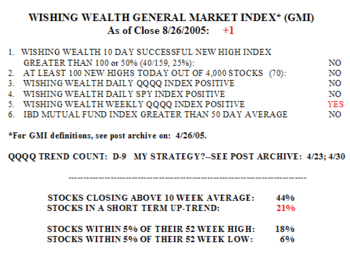 There were only 40 successful 10-day new highs on Friday–only 25% of the 159 stocks that hit a new high 10 days earlier closed higher Friday than 10 days earlier. There were only 70, 52-week highs in my universe of 4,000 stocks. 16% of the S&P 500 stocks advanced on Friday, along with 23% of Nasdaq 100 and Dow 30 stocks. Only 44% of stocks closed above their 10-week averages and only 21% are in a short term up-trend. The percentage of stocks closing withing 5% of their 52 week high fell t0 18%; 6% are within 5% of their 52 week lows (I am adding this "new low" indicator to the "new high" indicator I added in the prior post.)
This week’s WPM shows considerable deterioration in the Dow 30 stocks’ short term and longer term indicators. 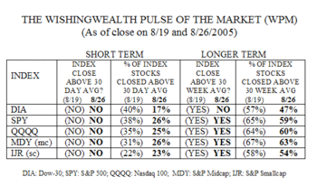 As implied above, the DIA ETF has closed below its 30 week average and less than one half (47%) of its 30 component stocks closed above their 30 week average, down from 57% on 8/19. All 5 indexes remained below their 30 day averages and there were substantial declines in the percentage of their component stocks that closed above their 30 day averages. For DIA, the percentage of stocks above their 30 day averages declined from 40% to 17%. Only about one quarter of the component stocks of the other four indexes remain above their 30 day averages. Thus, the short term trends for all five indexes and most of their components are negative. While all indexes but the DIA closed above their 30 week averages, there was some deterioration (in the 30 week averages)in their components too. Between 54% and 63% of the stocks in these indexes closed above their 30 week averages. Thus, while the longer term trend is negative for the DIA, the other four indexes remain in positive but weakened up trends–for now. Will they eventually follow the Dow’s lead? They usually do eventually, but time will tell.
The only positive technical sign that I have seen is that the put/call ratio is above .90, suggesting that relatively more option players than usual are betting on a decline by buying put options. So we may get a bounce soon, but it probably will be short lived and a chance to unload holdings. (A put/call ratio well above 1.00 might make me turn more positive, however.)
My current strategy is to follow Weinstein’s advice and I have already taken the defensive steps that he detailed in the quote above. I am now concentrating on finding short sale candidates for my IRA. Among my favorites are the banks. As short term interest rates increase and long term rates remain stable, the difference between them narrows. Banks profit from the spread between short term and long term rates. So, it is not surprising that many of the charts of bank stocks are looking ugly. Stocks trading below their 30 week averages include : WFC, C, JPM, WB, BAC, C–in short, many of the big names. 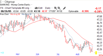 I could take any example to show you. Here is a daily chart of Citigroup. Look at the crossover of the 10 day average (dotted line) below the 30 day average (red line) in mid-June. This reversal was followed by high volume declines in July. Is the decline in C over? I would argue that things will heat up more for the banks when the Fed pushes short term rates above long term rates (inverted yield curve). This may not be the proverbial buying opportunity that value investors might perceive………….
From time to time I spot a well regarded high flyer that appears to be reversing. I did this once with a stock called ENR (Enron), which I bought puts on long before the bad news broke. The stock simply looked sick. Well, I spotted another candidate. Coffee drinkers please do not get angry with me, but SBUX looks sick to me. (If I am wrong, please do not sue me on coffee grounds 🙂 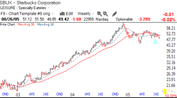 When I see a weekly chart of a stock that has been consistently above its rising 30 week average that appears to be below its reversing 30 week average, it sends me a strong signal of weakness to come. (Click on this chart to enlarge.) From early 2003 until the end of 2004, SBUX had traded well above its 30 week average. More impressive, its 10 week average (dotted line) has been above its 30 week average (red line) during that entire period. Now both averages have curved down and the 10 week is below the 30 week. (Cramer, if he understood and appreciated charts might shout; Sell! Sell! Sell!).
Why would SBUX be weakening? I don’t know anymore than I knew what was happening behind the scenes at Enron. The chart is simply picking up selling by the big holders. Maybe with the pinch of higher gasoline prices on the budget, coffee lovers will stay at home and/or forego that extra cup of $3.00+ java. Who knows? But stay tuned. (If it works out, remember you heard it here, first!)
As for me, I am looking at deep in the money January 06 puts on SBUX. I like tea, anyway. Have a great week and send me your comments. It really helps me to keep going. (Please note, while I try to answer all emails, some bounce back as undeliverable. Do you lump me in with spam?)
Please send me your feedback at: silentknight@wishingwealthblog.com.
 Only 38% of the Nasdaq 100 stocks advanced, along with 26% of the S&P 500 stocks and 17% of the Dow 30 stocks. However, the percentage of stocks in my universe of 4,000 that are in a short term up-trend increased to 43%. There were also 214 new highs, and 73% of the stocks that hit a new high 10 days ago closed higher on Thursday than they did 10 days earlier. Thursday is day 3 (U-3) of the QQQQ up-trend. Two former leaders showing strength Thursday are FORD and XWG (I own this).
 I don’t want to be paranoid, but could it be possible that some people knew that MO was going to be up-graded almost 3 weeks before all of this publicity broke? Maybe it’s all a coincidence, or a number of big buyers came to similar conclusions regarding MO’s being a great bargain, well in advance of the annnouncement??!! The only consolation for us, is that we technicians might also have jumped on this train in mid-August when MO rocketed to that new high. Will all these "lucky" early buyers of MO unload their shares Friday to the recipients of all of this media hype? What do you think?


