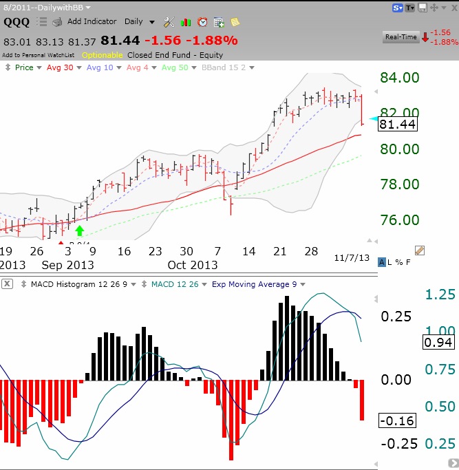
IBD now calls the “Uptrend under pressure.’ Meanwhile, I had already closed out my position in TQQQ earlier in the week. Why? I posted last Sunday night that I saw technical weakening in the QQQ, based on its diminishing stochastics and MACD histogram. Both indicators have continued to weaken. I want to show you, how the MACD histogram can illustrate something not seen in the price itself. This daily chart of the QQQ shows the MACD histogram below it. Note that in a 9 day period before Thursday’s decline, it looks to the naked eye like the price of QQQ remained level. At the same time, the MACD histogram was showing marked weakening! (The histogram plots the difference between the MACD and its signal line, which are both plotted on the histogram chart. When the histogram turns red, it means the MACD has fallen below its signal line.) The histogram actually turned red on Wednesday.
While my indicators show the QQQ remains in short and longer term up-trends, I did not want to own a 3X leveraged bullish QQQ ETF while the MACD histogram (and stochastics, not shown) was falling. Many suggest the MACD is a lagging indicator–not to me, or Judy, who taught me this! I will consider going back into TQQQ again when the histogram starts rising. Both the QQQ MACD histogram and stochastics were recently added to the indicators I count and post daily in the GMI-2 figure to the right.
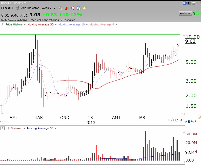
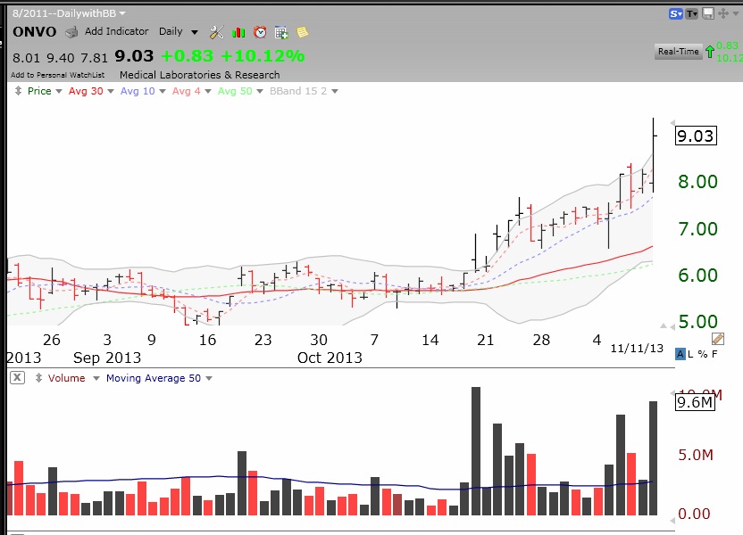 This weekly chart shows that ONVO is approaching its green line (all-time high) top.