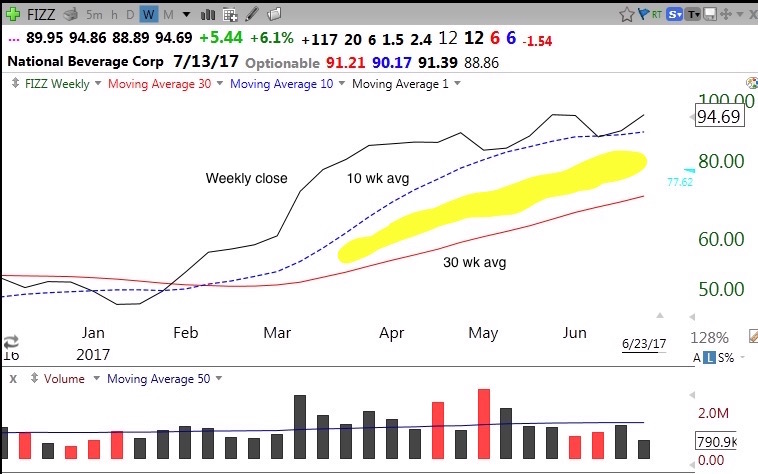
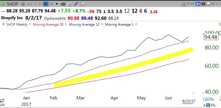
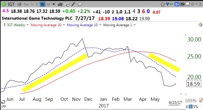
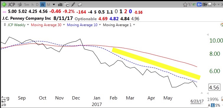
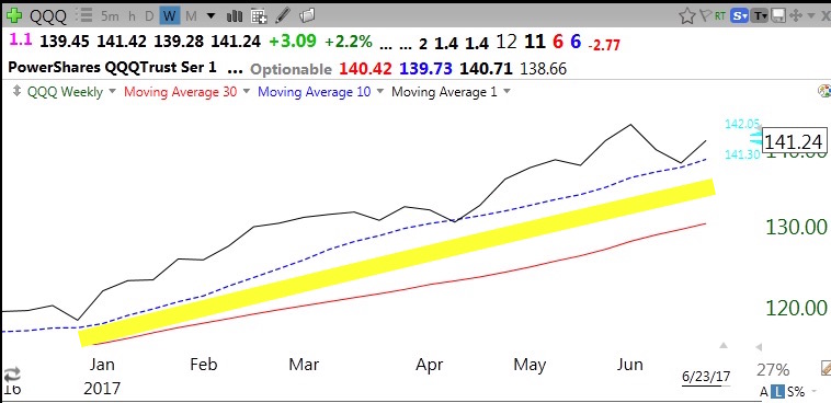
I wrote a few posts ago about a key chart pattern that I noticed in the 1990s, called yellowband. It is a way of staying focused on the longer term trend of a stock. A yellowband up-trend is a stock on a weekly chart that closes repeatedly above its rising 10 week average that in turn is consistently above its rising 30 week average. A yellowband down-trend is simply the reverse. The following charts illustrate yellowband patterns. Some charts show the transition from up to down trends. I discovered the value of the yellowband pattern in the 90s. I primarily buy stocks that are above or near their last green line break-out (GLB) that have a yellowband up-trend. I try not to sell as long as the yellowband is intact unless I see unusually high volume selling or a climax top. A close below the 10 week average is a significant technical signal for me to exit or reduce my position. If I had diligently checked a stock’s yellowband pattern I would not have been shaken out and exited many great stocks too early during the past few years. A picture is still worth 1,000 words….
The QQQ remains in a yellowband up-trend and recently found support at the 10 week average, a good place for me to enter or add to a position..
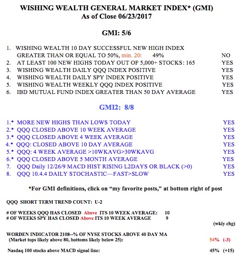
And the GMI remains Green.
Will post again on Wednesday evening.