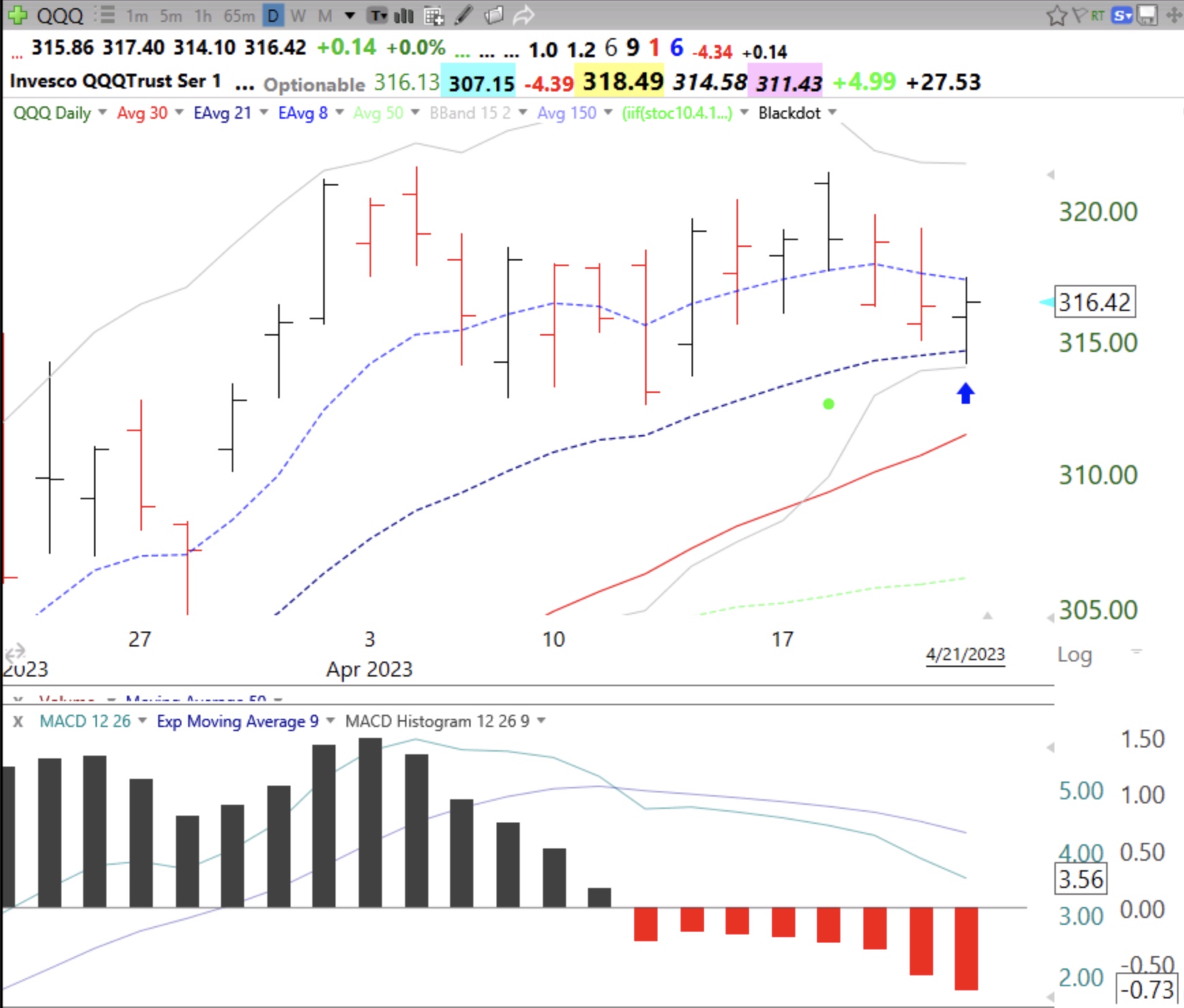
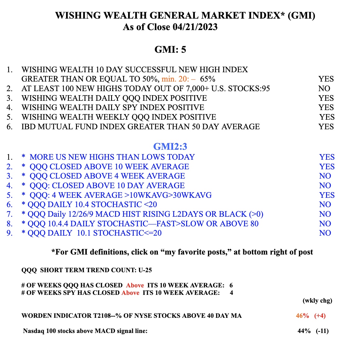
Equities mostly stay within their upper and lower Bollinger Bands. I use the 15.2 BB. When the bands contract it indicates reducing volatility. At some point the stock breaks out of the constricted bands and volatility explodes. The problem is one does not know in advance which direction it will go. On Friday, QQQ bounced up off of the lower band, see arrow on daily chart. The MACD histogram pattern is another useful indicator for gauging the likely direction and strength of a move. This daily chart shows the 12/26/9 MACD histogram bars being red (negative values) for 8 days, revealing weakness. This means the MACD is declining below its signal line, also shown on this chart. I also remain very cautious because the Sell in May period is imminent. I think there will be a huge debt limit debacle in June or July. Few market pundits are talking about it, which worries me. I went back and reviewed what ETFs rose during the 2011 debt stand off when S&P lowered the US treasury ratings. I found that gold and US treasuries rose. I am therefore holding some UGL and TLM. Both are 3x leveraged ETFs for gold or 20 year treasuries, respectively. I may be too early on this but I am watching these ETFs closely for signs of life. The GMI, shown below, remains Green at 5 (of 6) but the very sensitive indicators in the GMI2 are weak. Be careful.
TLM? Do you mean TMF? BTW, this was an excellent piece of analysis. Thank you.