When the market is in a down-trend it is much easier to identify the few gems that are resisting the downward pull of the general market, or even flourishing. Such stocks (like GMCR in 2009) may become the new leaders when the market turns. Stocks in a nice short term up-trend have a daily Red White and Blue (RWB) pattern with the six shorter term averages (red lines) rising well above the longer term averages (blue lines) so there is white space between them. I prefer to buy stocks in a daily RWB up-trend.
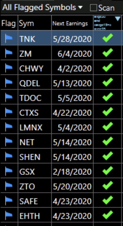
I created a set of column filters in TC2000 to find stocks in daily RWB up-trends that closed over $20 on Friday. In my IBD/MarketSmith watchlist of stocks that have been mentioned by these great services (plus a few others I identified), I found just 13 stocks out of more than 800 that met my criteria for being in an RWB up-trend. They are, in random order, TNK, ZM, CHWY, QDEL, TDOC, CTXS, LMNX, NET, SHEN, GSX, ZTO, SAFE, and EHTH (see table below).
These companies, of course, need to be assessed for other technical and fundamental criteria before considering their purchase. I usually do not buy such needles in the haystack in a declining market–the odds are against my profiting. It is obvious to me, however, why some of these stocks are rising during this market decline. ZM, CTXS, TDOC, EHTH and GSX likely benefit from the multitudes now going online to communicate and purchase goods.
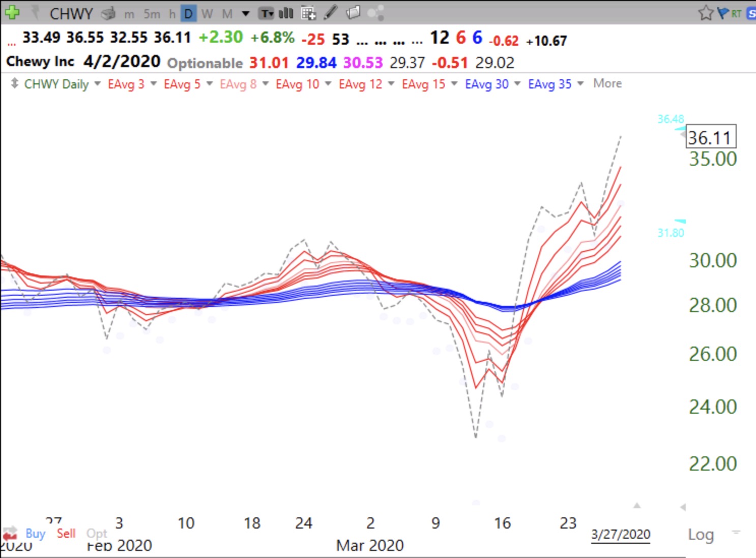
Also, I love CHWY, based on my own wonderful experience ordering food and toys for my newly inherited dog. CHWY has been said to be the Amazon of pet supplies. And owners pamper their pets in hard times. I set an alert in TC2000 to tell me when CHWY makes a GLB, at $41.18, but may buy a smidge now (just before earnings) in case it pops with earnings.
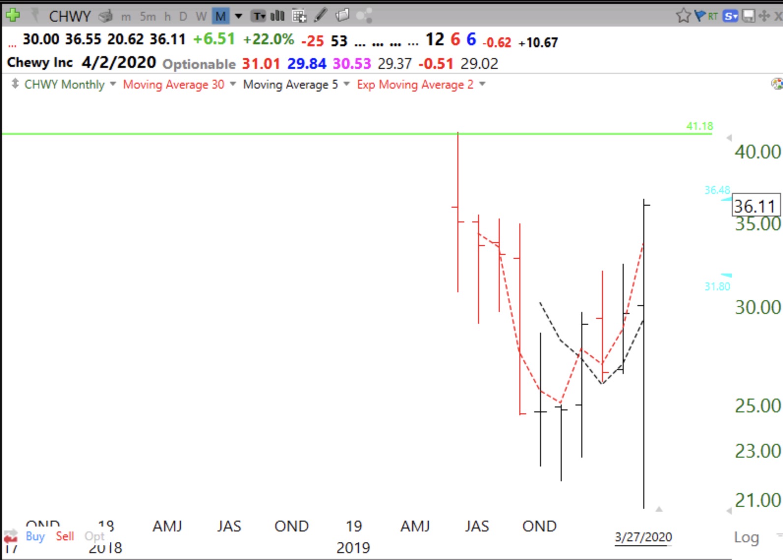
As Jesse Livermore and I, much later, have observed, a recent IPO that forms a peak (green line top), consolidates, and then closes at an all-time high on above average trading volume (GLB), can be a screaming buy as long as it keeps closing above its prior peak (green line). Here is CHWY’s daily RWB chart.
And its monthly chart showing its green line top.
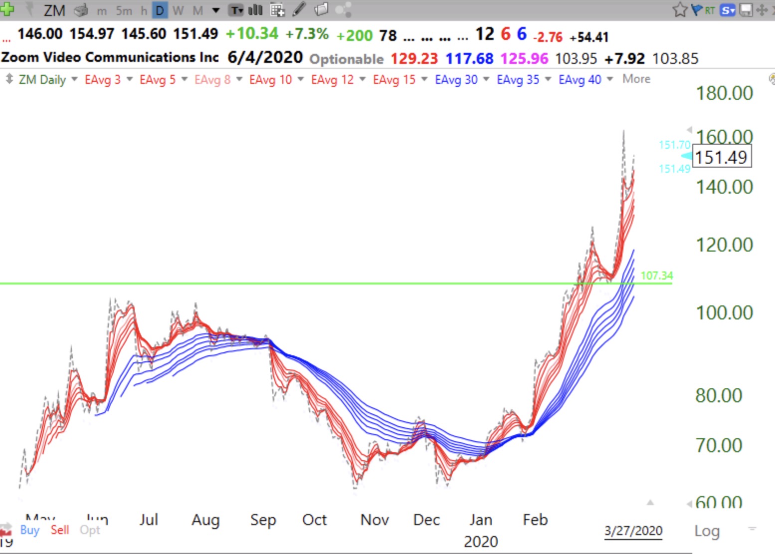
ZM is another example of a GLB for a recent IPO.—Note ZM’s daily RWB pattern before its GLB at 107.34.
Only 27 of 4,000+ US stocks met my criteria for a daily RWB up-trend, including the 13 already mentioned above. Several of these others are biotechs: MRNA, BNTX, IOVA. WDFC, not a biotech, has a nice chart pattern. Here are the 13, along with their projected next earnings release dates. CHWY reports this week. One day I will post the column filter formulas for a daily RWB in my TC2000 Club. Remember, buying strong stocks in a down-trend is especially risky and requires a strategy to cut losses quickly.
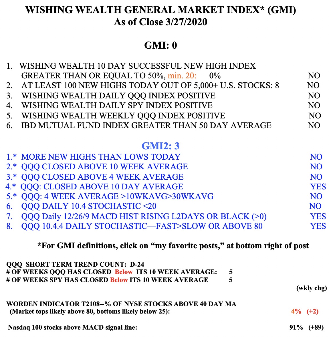
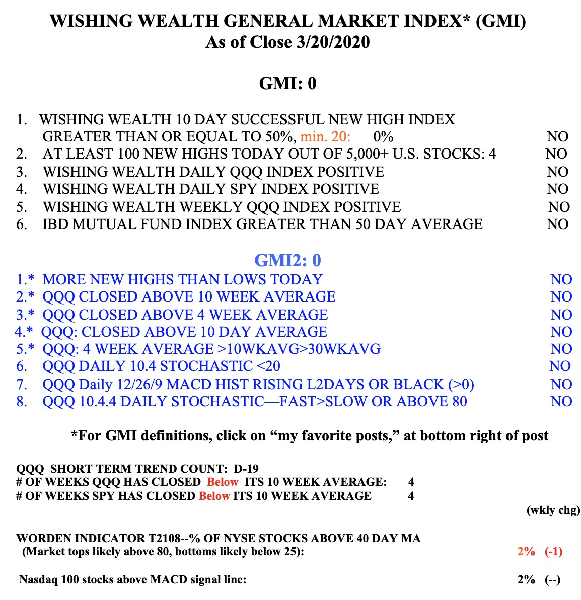
The GMI remains at 0 (of 6) and on a Red signal.