One of my favorie buy set-ups occurs with stocks or ETFs in a nice up-tend (Stage 2) that have a green dot signal. I explained the green dot signal in an earlier post. If you have TC2000, you can go to my club (Dr. Wish) and access the tutorial that David, my co-instructor, made for our students for automatically placing green dots on charts. Just go to my club in the publishing center in your TC2000 Library tab (Club= Dr. Wish) and select the video from the list at the bottom. There are also tabs at the top of this blog to access these resources. My blog glossary explains the many scans I have also stored in my club.
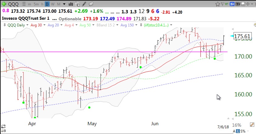
Here is the daily chart of the QQQ with green dot signals. Note that all green dot signals do not work and if it were possible to predict in advance which ones will, I would be living on my own island. The nice thing about the green dot set-up is that if the bounce fails, I can get out quickly with a small loss–the crucial sine qua non of trading success. Note the recent green dot, calling the QQQ’s current rise.
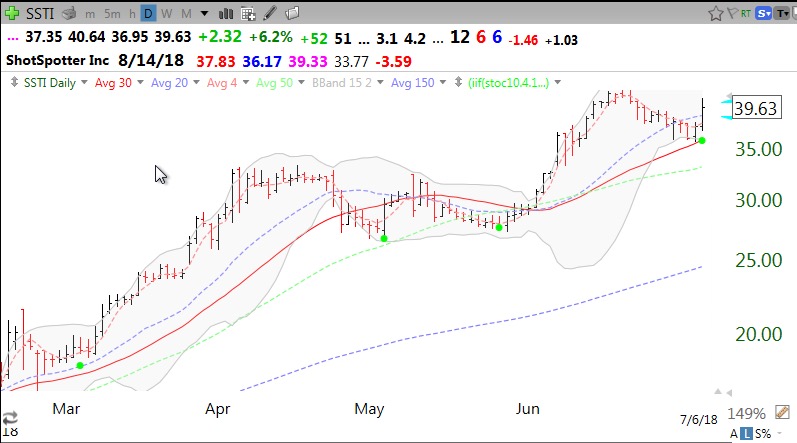
Last March, I opined about SSTI at 23.54. It subsequently took off without me and I have been waiting for another entry. Well, it had a green dot on Friday. Note the series of higher green dots.
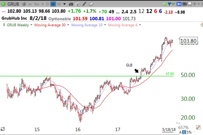
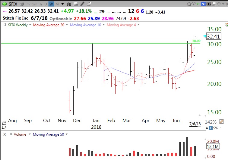
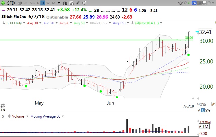
$SFIX, a recent IPO, had a green line break-out (GLB, see glossary) to an all-time high (ATH) on the weekly chart, Friday and a green dot (see daily chart). (I exit immediately if a stock closes back below its green line.)
I also posted in my club today a watchlist of 60 stocks that hit an all-time high (ATH) on Friday, ATH07032018– I should have labeled it 07062018! If the market advance resumes, stocks rapidly hitting all-time highs can be among the leaders. So I will watch this list for future green dots.
All of the above are educational resources and are not intended to serve as advice or recommendations. One needs to experiment with these tools and learn how to use them, if at all. In late August, I begin a 14 week class of 200 undergraduate freshmen who are right out of high school. I wish someone had taught me technical analysis at their age…..
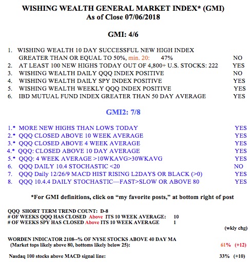
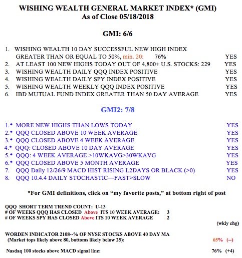
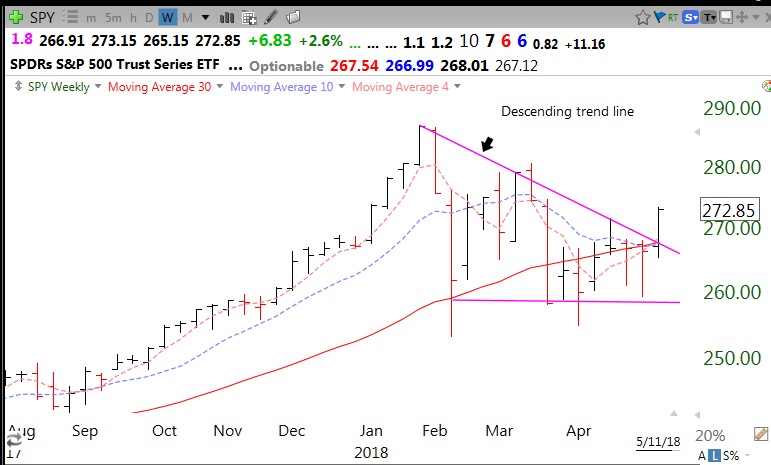
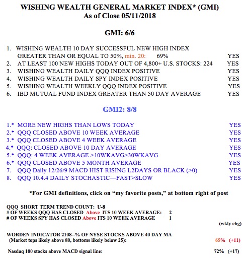
The GMI may turn Green and the QQQ short term trend count may turn up with an up day on Monday. Note the QQQ has closed above its 10 week average for 10 weeks, compared with the SPY, at only 1. The fact that the market did not sink amidst the trade wars is very bullish. How long will it last?
Many years ago I attended a lecture during which a very smart pollster questioned our country’s complaints about a trade deficit. He said, if other countries want to sell us their goods and products for our paper money, what is the problem? I add, since the U.S. is the most prosperous economy in the world is it not a fitting sign of strength for the U.S. to be able to buy a lot more than it sells to other countries?