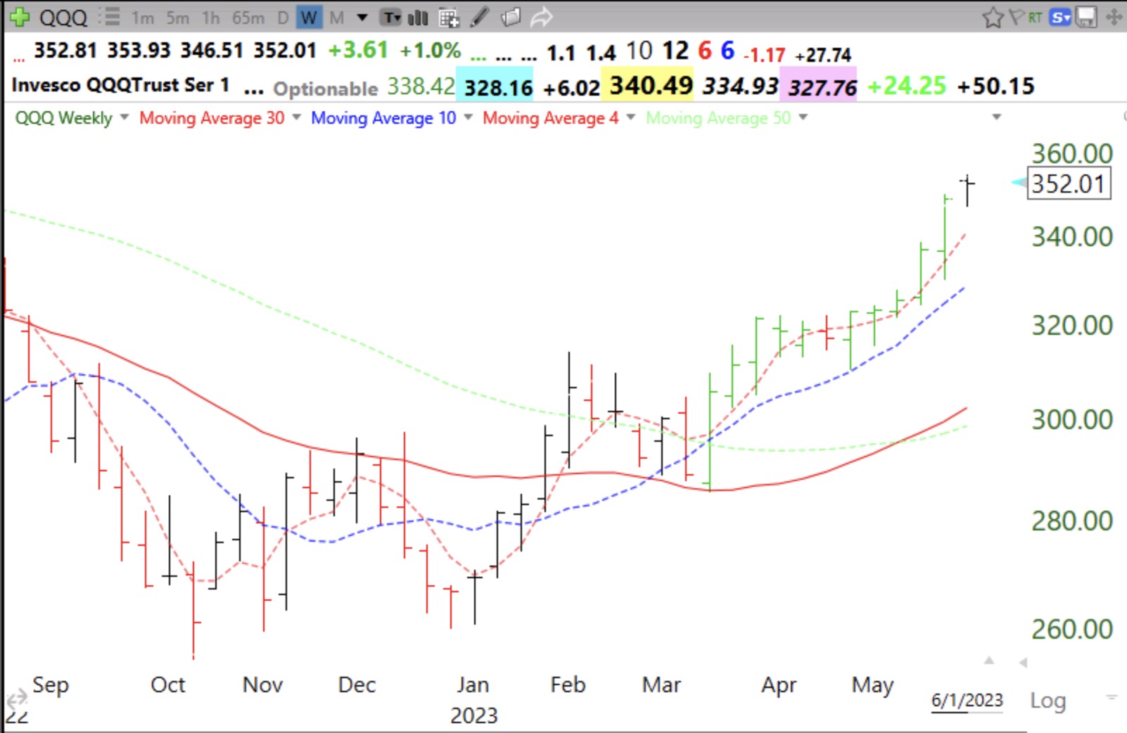
I have been transferring retirement funds from money market funds back into mutual funds. QQQ is now in a strong yellow band up-trend. See this weekly chart. QQQ is above its rising 30 week average (red line) and its 10 week average (blue dotted) is rising above the 30 week average. Note the clear space (no price bars) between the 10 and 30 week averages–my yellow band pattern. I used to fill this open space with a yellow highlighter=yellow band. A yellow band pattern is the sign of a strong up-trend. However, the current week’s bar is floating above its 4 week average (pink dotted). This suggests QQQ is extended and may fall back in line with its 4 wk average. See my 2021 Trader Lion presentation for an explanation of these chart patterns. The link is at the blog tab, Webinars.
I’m sure you mean Stage 2. I’ve had enough of Stage 4 the last 18 months! 😉
Dear Dr. Wish,
You mentioned “However, the current week’s bar is floating above its 4 week average (pink dotted). This suggests QQQ is extended and may fall back in line with its 4 wk average. “. I watched your entire 2021 Trader Lion presentation and while you had provided details on the 4 week chart, there was no mention of scenario where a current week’s bar is floating above its 4 week average. Would you please elaborate how you could conclude that QQQ is extended here? Thank you in advance!
When on a weekly chart the bar is floating above the 4 wk avg it often means a top or time for a rest for them to come together. Floating above is okay for a stock just taking off. Many strong stocks just ride their 4 wk avg for months. Look at AAPL for a fine example.
TY