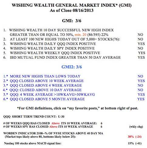
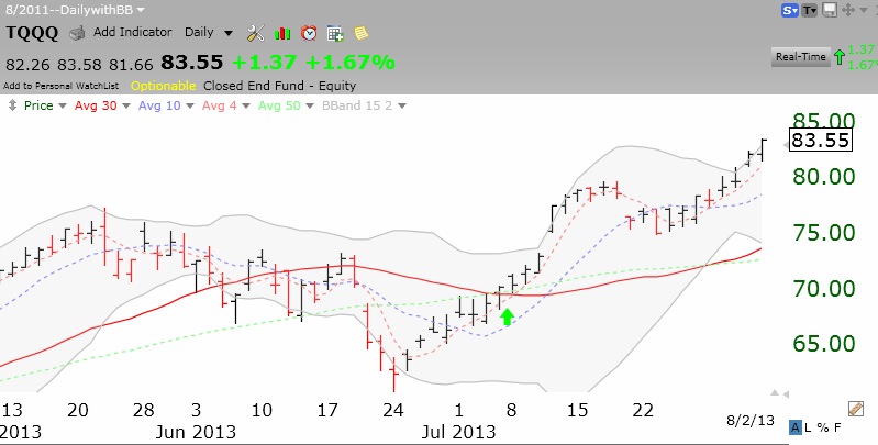
While the longer term up-trend is still very much in place, the short term trend is very risky. On Friday I wrote that IBD sees the market in a correction. My indicators have weakened too, with the GMI and GMI2 each at 3 (of 6). Now the Worden T2108 Indicator is very weak, at 38%. As this weekly chart shows, T2108 can bottom at this level, but most often it falls further before a bottom is reached. Currently, 38% of all NYSE stocks closed above their simple 40 day average price.
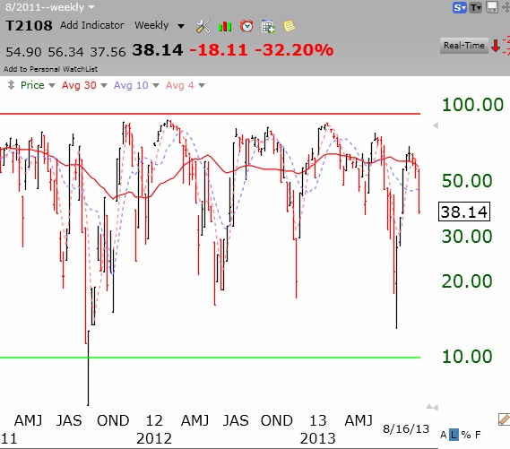
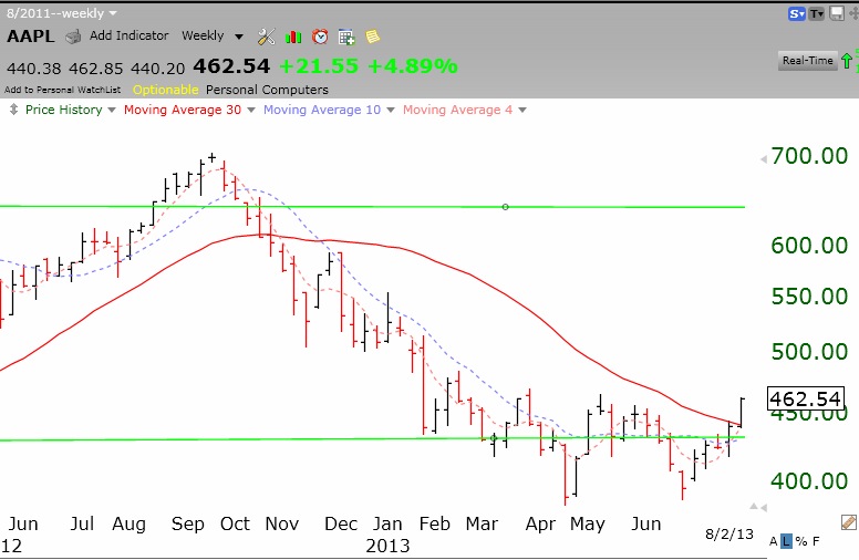
The horizontal green line in the chart is at an extreme level (10%) where major bottoms have occurred. The past three years, bottoms were very likely with T2108 under 20%. The SPY and DIA index ETF’s look weaker than the QQQ. This may largely reflect AAPL’s recent strength. AAPL comprises a large part of the Nasdaq 100 index, measured by the QQQ. Two down days in a row in the QQQ early this week could trigger a GMI Sell signal.
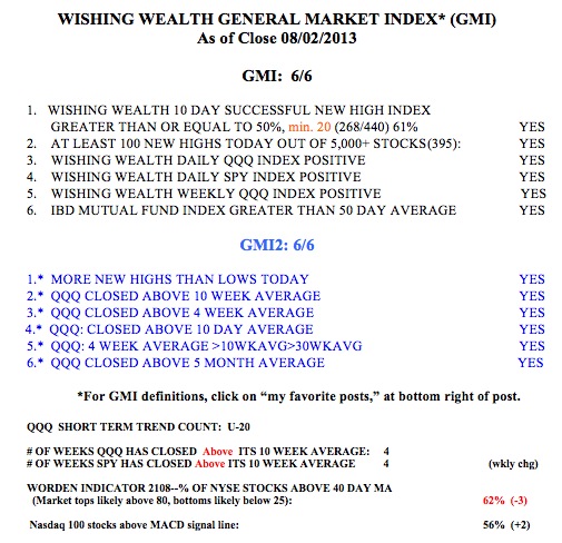
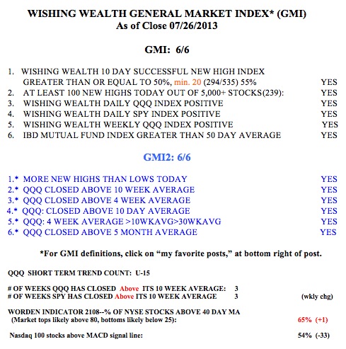
The table at the bottom of this post shows the components of the GMI and GMI2. The GMI would have to register zero for me to consider reducing the mutual fund holdings in my university pension. I think this is unlikely. However, I have eliminated almost all of the long positions in my trading accounts and bought some SQQQ last week. SQQQ is a 3X leveraged inverse ETF that shorts the QQQ. I hedged this long position with some put options so that I have controlled the maximum loss I could take if I am wrong and the QQQ rises (and SQQQ falls) during the period from now through late September when my options expire. This daily chart of SQQQ is the reverse of the chart of the QQQ because SQQQ rises as QQQ declines. Thus, when the QQQ gapped down last Thursday, SQQQ gapped up, as shown in this daily chart.
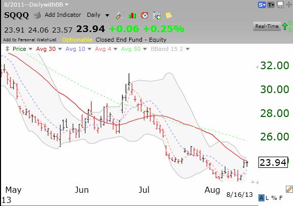
Last week QQQ declined -1.3% and SQQQ rose +4%. The leveraged ETF’s can be dangerous because they are designed to rise and fall three times faster than the underlying index. That is why I hedged my long position with put options. If QQQ falls a lot this week, you will recognize me by the smile on my face. 🙂