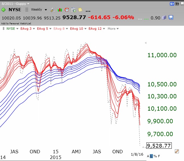
I assume that most U.S. part-time traders, like me, tend to monitor closely the U.S. stock indexes. I have been writing that the major indexes I follow (DIA, QQQ, SPY and NYSE) appear to be entering major down-trends, showing the RWB pattern I invented by modifying GMMA weekly charts. My charts have 12 exponential weekly moving averages, a band of 6 shorter averages plotted in red, and a band of six longer term averages in blue. A strong up-trend is evident when all of the red lines are well above the rising blue lines such that there is a white band separating them. I call this an RWB pattern, Red/White/Blue. A significant down-trend is evident when the reverse is true, giving a BWR pattern. I also include in my charts a gray dotted line that shows the weekly close of the index being plotted. This more recent price line (gray dotted line) tends to lead the averages.
The past few weeks I have been showing you that the U.S. indexes I follow have been transitioning from a multi-year strong RWB up-trend into a BWR down-trend. This is clearly evident in this weekly chart of the SPY. The NYSE index, composed of large multi-national stocks, is in a fully formed BWR down-trend.
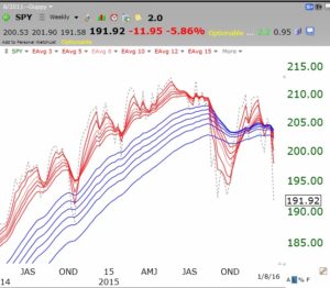

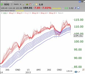
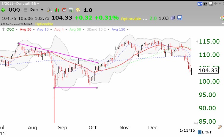
All of the other U.S. indexes I follow have patterns similar to the SPY, although the QQQ, shown below, composed of nonfinancial tech stocks, is less far along than the others in forming a BWR pattern. It is clear from these charts that these markets have come out of a multi-year RWB up-trend. In an RWB the gray dotted line is largely above the red averages, showing that the direction is headed up. In a BWR down-trend the reverse is true. Note that the gray dotted lines in the above two charts are now below all 12 averages, signalling a deepening down-trend. One sign of a new up-trend would be if the gray dotted line were to close back above all 12 averages, although I prefer to see the full RWB pattern develop before I trade big with a changed trend. My primary conclusion is that the RWB pattern (bull advance) of the lest few years in the U.S. markets is clearly over and no one knows when it will come back. Is it too late to sell? Sorry, no one knows.
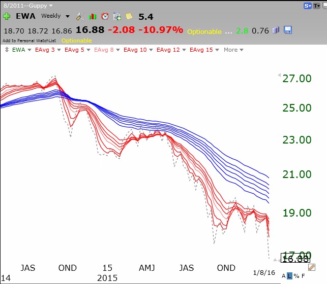
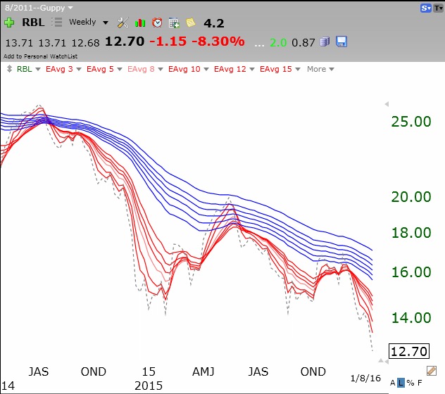
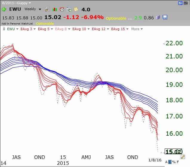
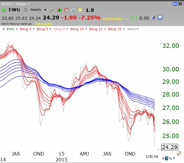
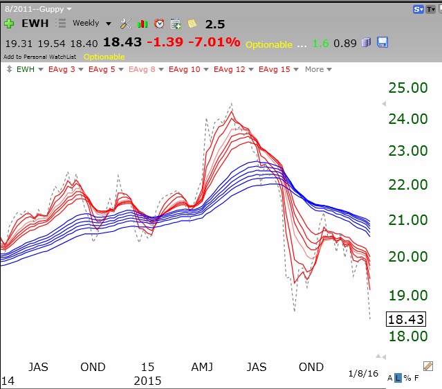
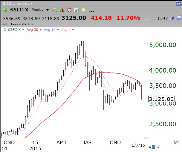
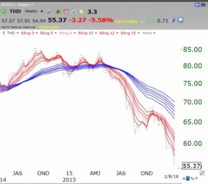
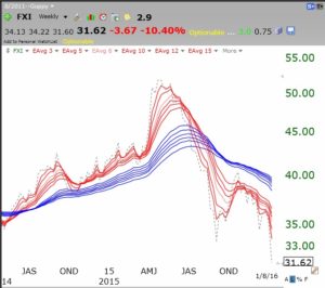
The above discussion would have been my routine analysis of the markets. But given the current market turmoil and the primary cause being ascribed to the market in China, I thought I would look at the chart patterns of markets world-wide. I examined 37 ETFs representing markets across the world. With the exceptions of the markets in Belgium and Ireland, all markets I examined were in well developed BWR down-trends! Can we legitimately blame all of this on China? I will post just a few representative examples below.
Thailand:
 Australia:
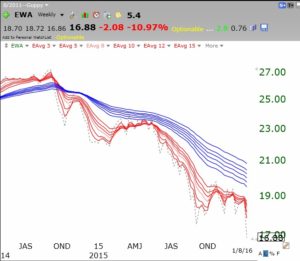
Russia:
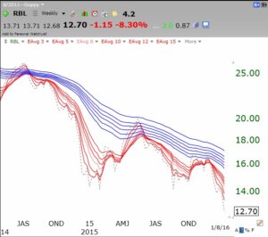 South Africa:
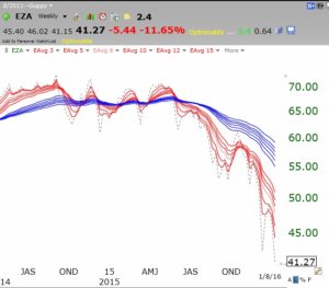 United Kingdom:
 Germany:
 HongKong:
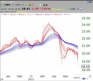 France:
 Chile:
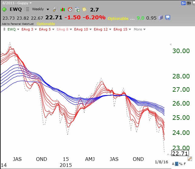
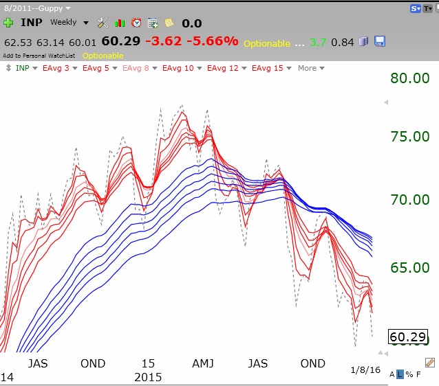
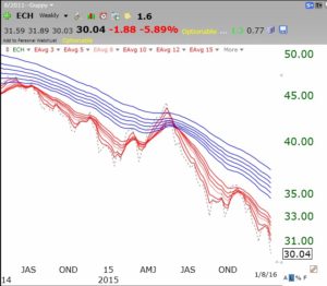 India:
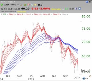 Egypt:
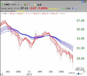 Sweden:
China 25:
 I am not an expert on world markets. Maybe one of you can comment on these relationships. Is it really possible that all world markets are going down because of the China market? I suspect not. There is probably another factor driving all of these markets? Deflating commodities?
Did similar relationships occur in 2008? Not all of these ETFs existed in 2008. When I looked back at the patterns across a few countries in 2008 I again saw tremendous similarity across the markets. That does not necessarily mean that we are entering another crisis like the one in 2008? Nevertheless, the possible implications of these charts concern me more than a little……..
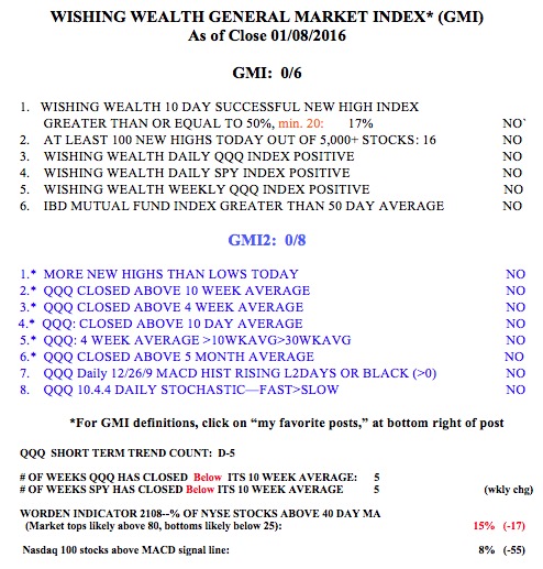
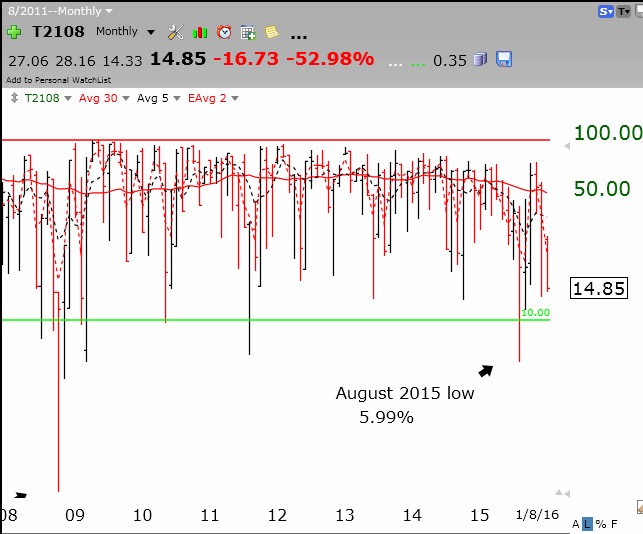
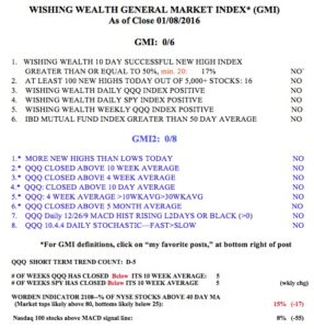
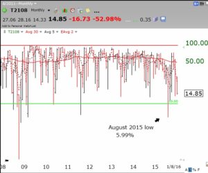
My GMI remains on a Sell signal with all indicators negative. Where is the bottom? A major past signal of panic-induced market bottoms that I have noticed is when the Worden T2108 indicator, now 15, falls into single digits. The monthly chart below shows that T2108 reached 1 at the 2008 bottom, 7 in 2011 and around 6 last August. I post T2108 each day, to the right of this page.
If T2108 goes below 10, I hope to hold my nose and move some cash into an index ETF (SPY or QQQ) or an index mutual fund. I will then only average up if the market continues to recover. I make this promise each time we have a large decline but seldom keep it! At the bottom the market always looks too scary to buy…..
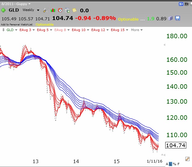
 I suspect the flight to gold, for safety, may be over for now. GLD is backing down from its upper 15.2 daily Bollinger Band where it was quite overbought.
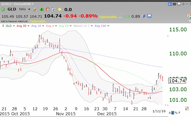 GLD remains in a multi-year BWR down-trend. See my prior post for an explanation of the BWR pattern.