The municipal bond collapse has begun–taking cover

GMI6/6
GMI-R10/10
T210871%

I am posting this message with great trepidation.

In my post written on June 8, 2008, I wrote:

“The major bank stocks look especially weak.

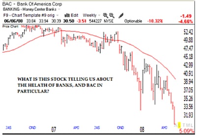
Look at this weekly chart of   Bank of America (red line= 30week average; click on chart to enlarge). Other bank stocks with similar charts include : WB, UBS, STI, and DB.   When major bank stocks are in a free-fall, can the rest of the market be far behind?”

At the time I wrote this post in 2008, BAC closed at $30.50     BAC bottomed out eight months later in February of 2009, at $2.53 along with the rest of the fallen bank stocks…….

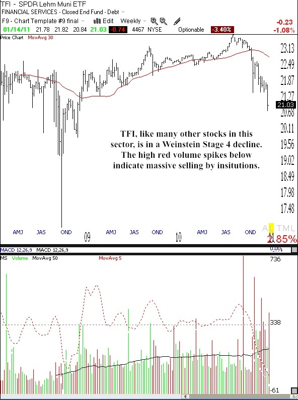
This weekend, I happened to notice that even though the market rose on Friday, there were 116 new 52 week lows in my universe of 4,000 stocks, the most since August 31, 2010.   Since then, there was only one other day when there were more than 100 new daily lows! Given this unexpected number of new lows on Friday, I sorted them by industry group and was struck by the fact that all but a handful of these new lows came from the municipal bond sector.   When I examined the weekly charts of these stocks I found a uniform pattern similar to that shown by the bank stocks in 2008, as they began their horrific descent.

Rather than show you a large number of individual charts, I present below the chart of the SPDR Nuveen Barclays Municipal Bond Fund (TFI) which tracks an index reflecting the US municipal bond market. (TC2007 lists the former name of this ETF.) Click on chart to enlarge. This chart is a classic Weinstein   Stage 4 pattern (see his book to lower right) which indicates a major decline. Most significant is the high red volume spikes, suggesting massive selling by institutions.

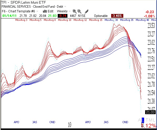
Below is my standard weekly GMMA chart, another indication that TFI is in a major down-trend, with all of the short term averages (red lines) below the declining longer term averages (blue). The bearish pattern (BWR) is the opposite of the bullish RWB rocket stock pattern, and is more like what I call a submarine pattern.

Now, I would not be sounding the alarm if this were the pattern of only TFI. Just examine the weekly chart of any of the many municipal bond ETF’s that hit a new low on Friday, for example:   NIF, MYN, VKQ, PZA, MLN……………..

In her recent interview on 60 Minutes, business analyst Meredith Whitney, who correctly predicted the sub-prime mortgage crisis, warned of the impending municipal bond collapse.   I recommend that you   listen to her interview. As you might expect, not everyone agrees with Meredith’s estimates of the degree of damage to the economy that will result.   On the other hand, as a technical analyst, I act on what the market behavior tells me, not what people opine.   And my reading of these charts is that the full scale exit from municipal bonds has begun. As I said above, when I saw the bank stocks declining in 2008, if this decline persists, can the rest of the market be far behind?

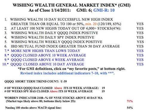
It may be time for me to take most of my profits off of the table and to prepare for the worst. I am glad I do not own any municipal bonds, but maybe my bank or mutual funds do? I hate to write this when the GMI and GMI-R are so strong, but the decline could come suddenly, when we reach the tipping point.   What do you think?

I wrote the above before the news came out about Steve Jobs.   The magnitude of the reaction of AAPL (and other tech stocks) to the news could give us an idea of whether the market is on shaky ground. The GMI and GMI-R are at their maximum levels, but remember that these indicators only detect a change in trend after it has occurred.   Such is the fate of trend following indicators.   One other indicator that is flashing a warning sign is the low percentage of bears in the Investor’s Intelligence poll–only 19.1%. This is a contrary indicator and such low percentages of bears tend to occur near market tops when almost everyone is bullish.

Where are we in the market cycle? Riding the up-trend.

GMI6/6
GMI-R10/10
T210863%

I used my favorite indicators to review the Dow 30 Index’s action since 1915, as this is how far back TC2007 allows me to track this index.   I looked at the monthly chart and the following indicators: 5 and 30 month simple moving averages and the 25.4.4 monthly stochastic. I am posting a chart of the Dow 30 since late 1992. A few patterns leap out at me.   First, notice how the Dow spent most of the time in the roaring 90’s   up-trend above the rising 30 month moving average (red line) and with the 5 month average (dotted line) rising above the 30 month average.   (Click on chart to enlarge.) The stochastic (in the lower window) with two exceptions, spent almost all of the time above the 80% “overbought” level (top parallel line), until it began a steady decline in 1999, foreshadowing the major decline in the Dow. The 5 month average declined below the 30 month average. The bear market bottomed out with the Dow below the declining 30 month average and with the stochastic around oversold territory, near 20% (bottom parallel line). The market turned up, the 5 month average rose above the 30 month average and the stochastic returned to near 80% again.   In 2008, the process repeated itself, with the 5 month turning down below the 30 month average and the stochastic declining until it became very oversold again, around 20%.   The market has now rebounded, the 5 month average is rising nicely above the 30 month average and the stochastic has just returned to overbought territory, an area where it has stayed for years in some previous rising markets.

So where are we in the current cycle?   It looks like we are in a strong up-trend with no sign of any weakening yet.   In fact, the 30 month average has not yet reversed up, but the 5 month average is moving up nicely above it.   Now I have learned in trading   over the past 40 years that patterns are meant to be broken.   The road is littered with the carcasses of Ph.D.’s who wagered heavily and lost, based upon complicated mathematical relationships that worked in the past.   I can tell you that the simple patterns I have discussed below seem to me to have worked well over the past 95 years.   Major bottoms in the Dow have occurred with this stochastic below 50% and the more severe ones, around 20%.   So, I won’t begin to suspect the end of the current up-trend until I see the stochastic turn down and the 5 month average decline below the 30 month average. I’ll let you   know when that happens…….

Meanwhile, my General Market Indicator (GMI) remains at the maximum reading (6 of 6) and the more sensitive GMI-R is at 10 (of 10). Thus, all of my short term and longer term indicators for the   QQQQ (Nadaq 100 tech stocks), and the SPY (S&P 500 stocks) remain positive. The QQQQ and SPY have closed above their critical 10 week averages for 15 straight weeks. However, Friday was only the 15th day of the QQQQ short term up-trend.   The Worden T2108 Indicator is at 63%, in neutral territory. And 68% of the Nasdaq 100 stocks closed with their MACD above its signal line, a sign of short term strength. The weekly GMMA chart below shows that all of the short term averages (red) are above the rising longer term averages (blue), reflecting an established up-trend. So with my more conservative funds, I am adding to my positions in the major index ETF’s like QLD, SPY and DIA, a comfortable way for me to ride the up-trend.

Length of QQQQ short term up-trend nears recent peaks; Decreasing leverage

GMI5/6
GMI-R8/10
T210863%

I did an analysis of the length of all of the QQQQ short term up-trends (as defined by me) going back to July, 2006.   Including the current up-trend, there have been 25.   Six (24%) of these past 25 up-trends lasted for more than 50 days.   Of these 6 longest up-trends, 4 lasted between 50 and 59 days and two lasted more than 60 days (86 and 80 days). So this tells me that given that the current QQQQ short term up-trend completed its 49th day on Friday and it would take a minimum of 2 more days (for my indicator to turn negative) to end the up-trend, we are in   the vicinity of where most of the longest short term up-trends have ended.   Now, I am the first to say that anything is possible in the market and precedents are meant to be broken.   But I like the odds to be on my side. Given that the QQQQ has risen almost nonstop since early September (almost +15%), it may be a good time for me to take off some of the leverage inherent in my call options now and to get ready to exit my swing positions if the trend turns down.   I am not exiting my longer term university pension mutual funds because the longer term up-trend remains intact and any short term down-trend could be quite short.

The GMI has declined one, to 5 and the more sensitive GMI-R two, to 8. (Click on chart to enlarge.) The SPY and QQQQ have closed above their critical 10 week averages for 11 weeks. Note that the Worden T2108, an indicator that acts as a pendulum of the market, has declined to 63%. This means that only 63% of NYSE stocks are above their 40 day moving averages, and that the market is now out of the area where market peaks occur.   On the other hand, the T2108 is far above the level (below 20%) where market bottoms tend to occur. Another sign of weakness is that only 35% of the Nasdaq 100 stocks closed with their MACD above its signal line.

I am not looking to take on new positions now, but I will buy an inverse (bearish) index ETF if the QQQQ enters a short term down-trend.